

Tue, Dec 29, 2020
UNICEF has been expending great effort to map schools in developing countries. Part of the United Nations (UN), UNICEF provides humanitarian and developmental aid to children worldwide. One of their goals is to facilitate children's access to education. By combining high-resolution satellite imagery, UNICEF's Office of Innovation created a model capable of recognizing schools . Distinctive features of schools as viewed from above allowed the model to distinguish them from other buildings.
However, UNICEF wanted to ensure that they avoid biases in their model as much as possible. Hence, UNICEF and Tryolabs partnered together to understand how UNICEF's Machine Learning model was actually performing by employing explainable artificial intelligence (XAI) methods. Leveraging AI for social good was the essence of the project and our main goal.
Training a machine learning model to identify schools from satellite imagery of developing countries is a difficult task. Our collaboration brought together their experience and our AI skills to gain new insights into their model’s predictive behavior. At Tryolabs, we believe this kind of partnership promotes innovative and unique results. At one of our latest projects we partnered with real estate strategist to provide evidence-based analysis and insights on the U.S. real estate markets affected by COVID-19.
Now, we'll detail how to uncover tricky biases in AI solutions that can negatively impact the outcomes for which the AI solution was designed.
Specifically, we'll cover what are AI4SG and open data, and the challenges of identifying schools from satellite imagery. Along with some XAI methods:
- Misclassified analysis
- Revealing a model’s focus area in images using gradient class activation maps
- Discovering biases by clustering on model feature embeddings
- Linking model biases with their effects on people by using open data and spatial analysis


AI for social good (AI4SG)
Employing AI to address social issues and improve the wellbeing of humanity emerged during the last decade under the umbrella term AI for social good (AI4SG). Some researchers may not believe that AI4SG can be clearly defined, because the common good, while always referenced as a goal, is itself never well or fully defined. What’s more, groups with different interests and needs may have different notions of what constitutes the common good.
Simply having good intentions does not seem to be enough to design for the common good. That being said, some consider it important for AI researchers and practitioners to follow relevant recommendations to avoid the pitfalls associated with contributing to the common good.
These may include:
- considering various facets of knowledge
- identifying and involving different stakeholders
- dealing with politically-charged environments
Another piece of advice for engineering teams would be to try and see outside of a technology-centric point of view in order to understand that some social issues cannot be solved, only addressed.
On the other hand, some experts are more optimistic about unlocking AI4SG opportunities. They would argue that the lack of a clear definition supports rather than hinders the pursuit of AI4SG, similar to how the lack of a common definition for AI helped the field to grow and innovate beyond its original boundaries.
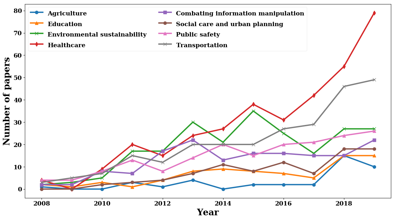
Since the rise of AI4SG, there have been many diverse applications in various domains (see Figure 1). For a more detailed review check our post AI applications for social good.
Currently, AI4SG initiatives are receiving more and more investment. However, solving AI4SG-related problems requires collaborative effort on the parts of different social actors/groups: companies, academia, governments, and NGOs. This interdisciplinary collaboration has never been more important.

Another key element in the growth of AI4SG is open data, defined as data that can be freely used, modified, and shared by anyone for any purpose. Data fuels machine learning algorithms, which need large quantities of it to perform well. There has been a stronger push to make government data more open by claiming that citizens have the right to access government documents and proceedings in order to allow for effective public oversight. Open government data (OGD) is a philosophy that promotes transparency, accountability, and value creation by making government data available to all.
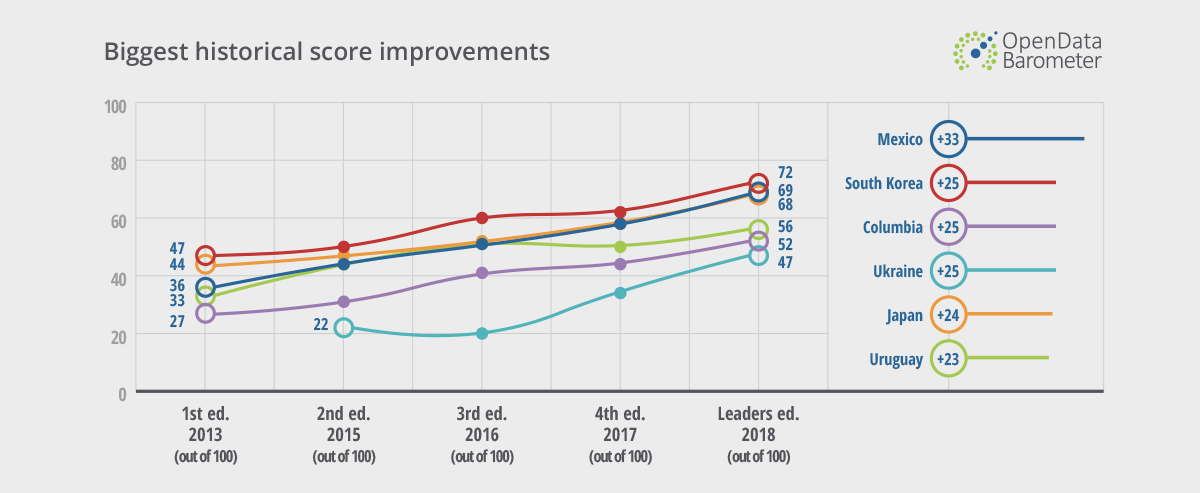
In 2007, the 8 principles of OGD were defined. Since then, the OGD initiative has established a set of policies that many governments leverage to make information more accessible to the public. Despite the overall increase in government transparency (Figure 2) and the positive socio-economic consequences, the Open Data Barometer indicates that still relatively few datasets are open. The Open Data Barometer implies that little progress has been made after a decade of pushing for open data. Significant investment in resources is needed to create the policies, practices, and infrastructure to make open data a feature of day-to-day governance.

Recently, AI4SG applications and open data have been focal points for the United Nations (UN). Their plan of action, "Transforming our world: the 2030 Agenda for Sustainable Development," is a commitment to work on 17 sustainable development goals (SDGs). By using emerging AI technologies and promoting implementation of open data principles, the UN is trying to accelerate the fulfillment of these SDGs.
The UN Secretary-General's High-Level Panel on Digital Cooperation called for immediate action on its Recommendation 1A: Universal access to connectivity. Launched in 2019 by UNICEF and ITU, Giga aims to connect every school in the world to the internet and every young person to information, opportunity and choice.
This initiative frames the partnership between UNICEF and Tryolabs. The first step was to map school locations.
"UNICEF works in over 190 countries and territories to save children’s lives, to defend their rights, and to help them fulfill their potential, from early childhood through adolescence"
Explainable Artificial Intelligence (XAI)

Explainable AI (XAI) is has become one of the hottest topics in AI as outlined earlier this year in our blog post, AI trends: what to expect in 2020. XAI emerged to explain how a machine learning model makes decisions (see Figure 3). Most frequently used machine learning algorithms work like black boxes with opaque internal workings. Considering that machine learning models are everywhere, affecting peoples' lives and sometimes treating them unfairly, the ability to explain the model's predictions is a must (see right to explanation) rather than an option. Machine learning models can fail and misclassified cases are an unavoidable consequence of using them. However, human understanding of these failures allows us to minimize them, discover unwanted biases, and build trust among end users.
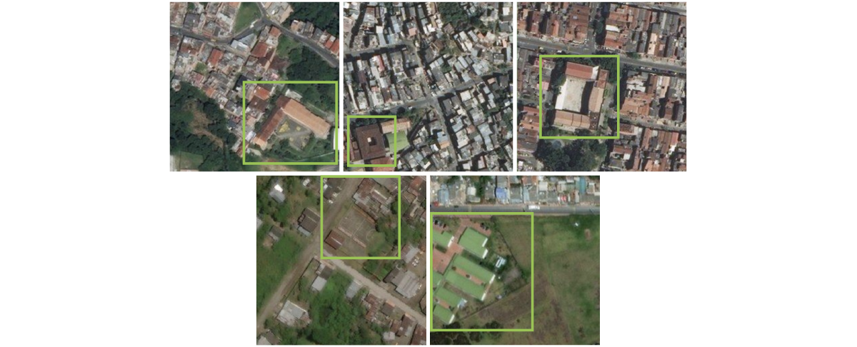
Recognizing schools from satellite images is not an easy task. As we mentioned earlier, there are some distinctive features of schools as viewed from above that allow the model to distinguish them from other buildings. These characteristics may include L, O, and U shapes, or the presence of playgrounds and grouped buildings (Figure 4). Such an image classification task faces many challenges, including:
- Dataset creation: label thousands of satellite images for the presence or absence of schools to train, validate, and test the model given different landscapes, e.g. urban versus rural areas. Maintain a balance of labels.
- Multiple buildings: confirm that the model is learning characteristics of schools and focusing on the right building when multiple buildings are present in the image (this is more common in urban areas)
- Similarity: Schools can share similar characteristics with other public buildings

We trained a Shift-Invariant ResNet18 Convolutional Neural Network (CNN) to perform image classification and detect schools in satellite images. The entire dataset received from UNICEF was randomly split as 80% of images for training (2191 images) and 20% for testing (685 images). The validation dataset was 20% of the initial training dataset (548 images). The dataset was slightly imbalanced towards "not-school" labeled images (66%).
Data augmentation was accomplished via the following training image transformations: random horizontal flip, random vertical flip, random rotation, random scale, and random brightness. We used the open-source PyTorch machine learning library to train, validate, and test the model. All images were at zoom level 18 and taken over Colombia, where UNICEF had previously collected and labeled data.
The trained model was 84.38% accurate and that seemed good considering the difficulty of the task and the simplicity of the approach. The precision and F1-scores for the “not-school” label were better than those for the “school” label, so the classifier was more prone to failure when predicting the “school” label rather than the “not-school” label (Table 1).
Table 1. Summary of classifier performance metrics with the test dataset.
| Model | Accuracy | Label | Precision | Recall | F1-score | n |
|---|---|---|---|---|---|---|
| Shift-Invariant ResNet18 | 0.844 | school | 0.738 | 0.847 | 0.789 | 236 |
| Shift-Invariant ResNet18 | 0.844 | not-school | 0.913 | 0.842 | 0.876 | 449 |
Looking into the misclassified images, we found that the model tended to predict the “school” label more frequently when buildings were present (Figure 5). Therefore, we decided to manually split the test dataset into two subsets: one of images with many buildings present (urban) and another of images with few or no buildings present (rural).
The model was more accurate in the rural than the urban scenario (Table 2). The difference was due to the presence of a large number of images without buildings in the rural scenario that made it very easy for the model to predict a “not-school” label (precision: 0.966). On the other hand, it was very difficult for the model to detect the “not-school” label in the urban scenario (precision: 0.625). The “school” label prediction wasn’t bad for either scenario (urban “school” precision: 0.720, rural “school” precision: 0.782).
At this point, we concluded that we had a high bias in the dataset towards images lacking buildings. That allowed the model to fool us—sometimes, not always—by simply learning to predict a “school” label when a building was present. However, the model demonstrated shallow learning about what a school was. If the data hadn’t been split into urban and rural scenarios, we wouldn't have been able to unmask this behavior. This shows the importance of playing with your data.

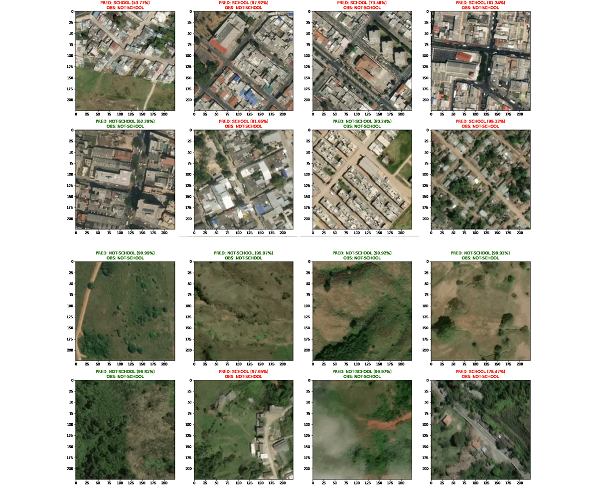
Table 2. Summary of classifier performance metrics with the urban and rural test subsets.
| Model | Accuracy | Subset | Label | Precision | Recall | F1-score | n |
|---|---|---|---|---|---|---|---|
| Shift-Invariant ResNet18 | 0.696 | Urban | school | 0.720 | 0.853 | 0.781 | 163 |
| not-school | 0.625 | 0.426 | 0.506 | 94 | |||
| Shift-Invariant ResNet18 | 0.932 | Rural | school | 0.782 | 0.836 | 0.808 | 73 |
| not-school | 0.966 | 0.952 | 0.959 | 355 |
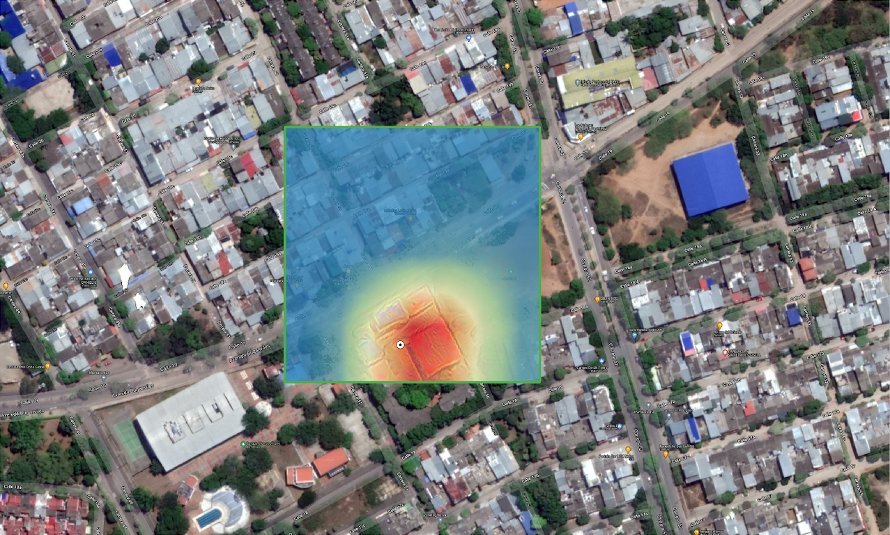
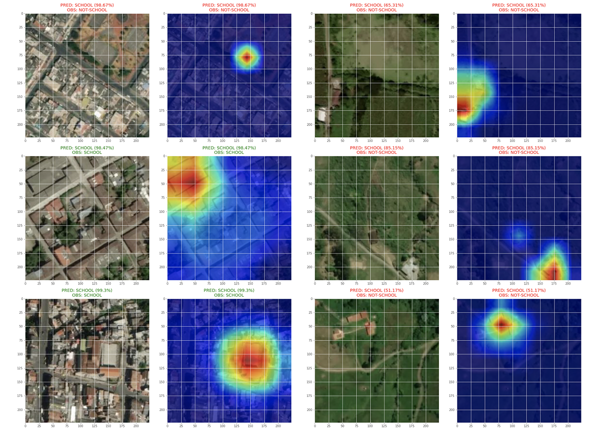
Still feeling skeptical about our model’s performance, we asked ourselves: Is the model looking at the correct building among other buildings in the image when predicting a “school”? To answer this question, we used gradient class activation maps (grad-CAM) to call out where the CNN was looking (Figure 6). We selected this method because it passes sanity checks proving that it is connected to the model’s weights and training data (see “Sanity Checks for Saliency Maps” for a deeper discussion). We found that nearly 83% of the model’s predictions located the correct building.

Considering that the trained model had a shallow understanding of what constitutes a school but in the vast majority of cases identified the correct building, the next step was to find the subclasses of the broader predicted class, “school.” Instead of manually separating urban and rural images, we used an unsupervised clustering method to differentiate them. We tried k-means, Gaussian mixture models and spectral clustering.
In this case, the k-means algorithm performed better. The clustering was based on feature embeddings taken from “school” labeled images provided to the outermost layers of the trained feedforward shift-invariant ResNet-18 (Figure 7). The feature embeddings were scaled and then subjected to dimensionality reduction using principal component analysis (Figure 8). A cluster quantity of four was selected using the elbow method. A high cluster overlap was detected due to very low mean silhouette values. Sharp differences in the areas surrounding the schools were observed. One cluster formed around images with very rural landscapes, another contained images with urban landscapes, and the last two gathered images with something between rural and urban (Figure 9). This approach seemed to emphasize context or differences in the environment around schools instead of the distinctive characteristics of school buildings.
T-distributed stochastic neighbor embedding (t-SNE) was used as a nonlinear dimensionality reduction technique to visualize high-dimensional data (64 features). The CNN feature embeddings were reduced to two-dimensional vectors in such a way that similar samples were modeled by nearby points and dissimilar samples were modeled by distant points.

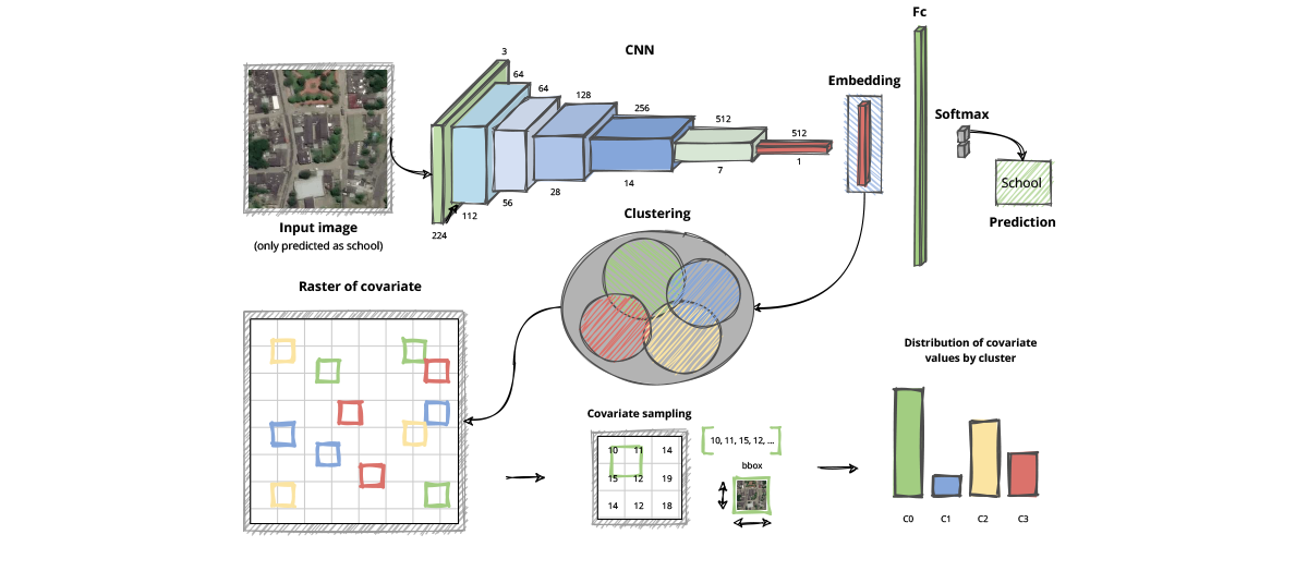

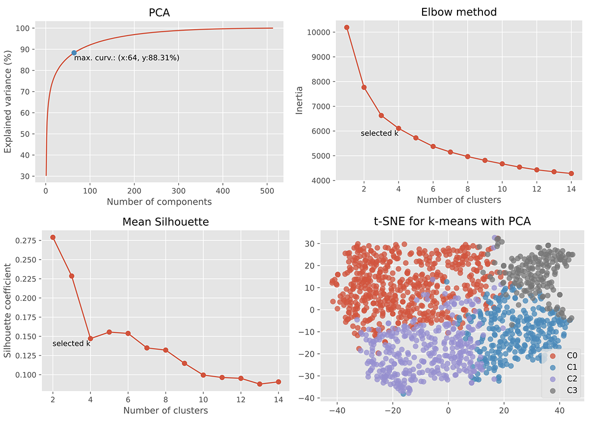
In order to characterize the different clusters obtained from the feature embeddings taken from the CNN, we matched the spatial locations of the images with different covariates (Figure 9). The covariates selected were the ones that could have a meaningful impact on the landscape attributes of the places where people live: 1) distance to major roads, 2) distance to major waterways, 3) distance to nature areas, 4) night-time lights, 5) elevation, 6) terrain slope and 7) population between 5 and 10 years old by gender. This data came from open WorldPop datasets.
For each cluster, the distribution of each variable was analyzed and compared. Again, the biggest differences observed between clusters occurred between the most rural cluster (C3) and the most urban one (C2). The most rural cluster was defined by greater distances to major roads and waterways, less artificial light intensity at night (lower urbanization), lower elevation, steeper terrain slope values, and a smaller population (Figure 10). In some cases, covariate values were log-transformed to reduce large differences in scale.

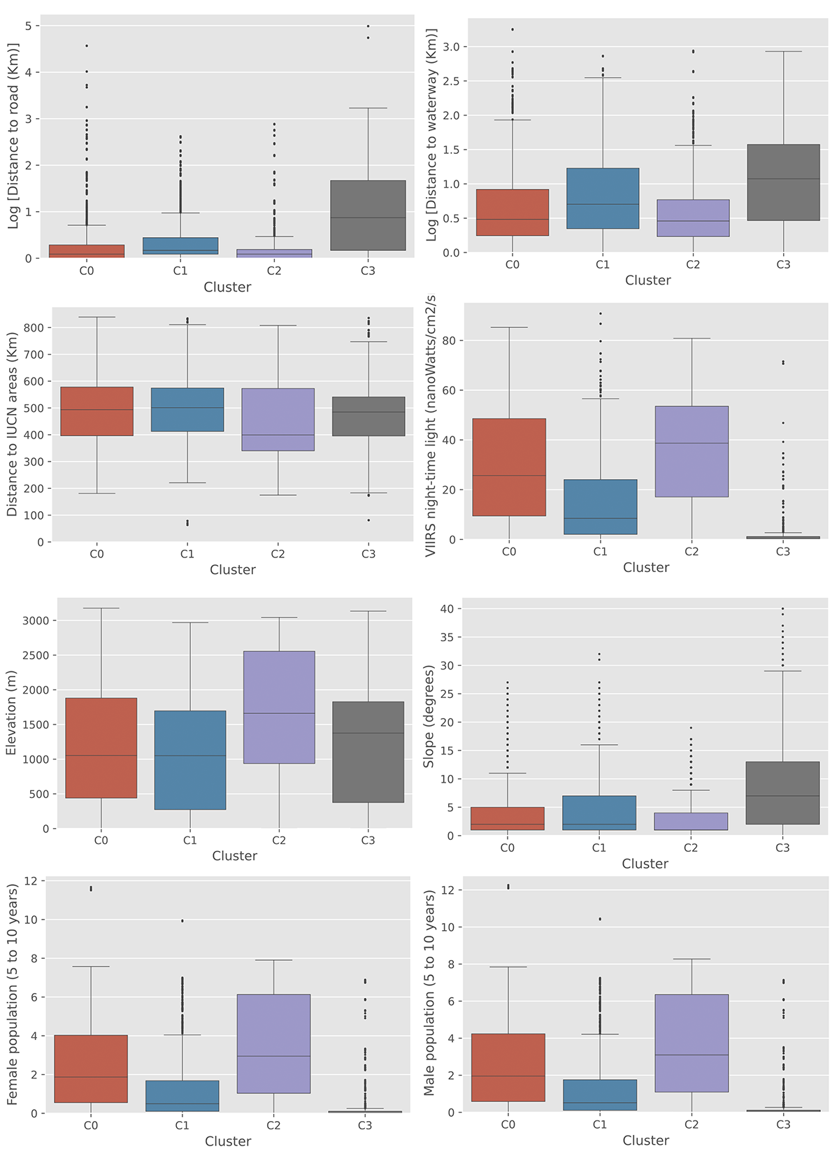
Regarding the model’s precision when predicting the school label across clusters, the model overfit to C2 and C3. Additionally, the most rural cluster, C3, experienced the lowest testing precision (Table 3). Most likely, the C3 cluster is the poorest in terms of infrastructure and accessibility to schools. Proceeding with the model will not help the people who live in these areas where aid is most needed. We proved what UNICEF already suspected at the start of this partnership.
Table 3. Training and testing accuracies obtained with the different clusters.
| Cluster | Dataset | Precision |
|---|---|---|
| C0 | Train | 0.717 |
| Test | 0.672 | |
| C1 | Train | 0.972 |
| Test | 0.898 | |
| C2 | Train | 0.952 |
| Test | 0.785 | |
| C3 | Train | 0.776 |
| Test | 0.571 |
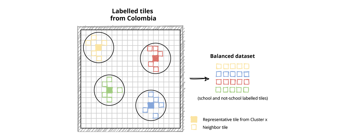
We found that the trained CNN model exhibited heterogeneous performance across different landscapes. The cluster analysis uncovered patterns underlying the dataset that should be addressed. Retraining the model with a new, balanced dataset of tiles that encompasses the full range of the covariates analyzed would be a next step to obtaining greater accuracy and minimizing bias (Figure 11).
In summary, the XAI methods permitted understanding of how our trained model was working and how to improve it with the aim of helping the most people in need.
Summarizing, by employing Explainable AI methods on innovative ways we could understand how our AI model was working. We found hidden biases in the dataset that were translated to inequalities during the final AI model usage. Re-train an AI model with a new dataset based on landscape features will improve school detections on satellite imagery and should be the next step.
We learned that this AI4SG project required an open approach of open data, open source code and an open mind to consider different fields of knowledge.
By joining efforts, GIGA and Tryolabs can better serve the purpose of providing internet to every school in the world.
Wondering how AI can help you?

© 2025. All rights reserved.