

Enhancing business storytelling with data


The Covid-19 pandemic has created a global economic recession that impacts businesses across all sectors, and real estate is no exception. According to World Bank forecasts, the global economy will shrink by 5.2% this year. In this uncertain scenario, data becomes a highly valuable asset for identifying patterns, trends, and ultimately insights that can help us navigate the new decision-making pandemic landscape. To better quantify the impact of coronavirus, we partnered with real estate strategist Mike DelPrete, to provide evidence-based analysis and insights on the U.S. real estate markets.
In this blog post, we explain the collaboration process for building and enriching business storytelling with data by following an intuitive methodology and using leading-edge, open-source software. With this collaboration process, we were able to discover and narrate the impact of Covid-19 for the real estate audience enriched by data insights.
We divided the blog post as follows:
The Covid-19 real estate landscape: an explanation of our major findings and insights on the impact of Covid-19 on the U.S. housing market.
Enhancing business narratives: a discussion of the methodology, techniques, and technologies used for planning and executing the data analysis to enhance business narratives and storytelling.
Let’s get started!


The Covid-19 real estate landscape
Mike is internationally recognized as an expert and thought-leader in real estate tech. We met him at Inman Connect (ICNY) 2020, where he presented the state of the real estate industry. Inman hosts the Real Estate Connect conferences where leaders in real estate gather to network and learn about the latest in real estate technologies. In his talk back in January, Mike states:
The real estate industry is moving very slowly, but it’s never moved this fast.
To prove his statement, he explains the rapid growth of the tech-enabled disruptors to the industry, the instant buyers, or iBuyers. iBuyers, represent one of the biggest game-changers in real estate. The new iBuyer business model aims to transform how consumers buy and sell properties digitally. Billions of dollars have been invested in iBuying since 2014. In our blog post “Real estate and machine learning: takeaways from Inman Connect 2020,” we further explore the real estate tech-based landscape.
These market growth projections occurred before Covid-19 came on the scene. Major transaction drops were seen internationally (70 to 90% at times), as the pandemic spread world-wide and lockdown measures were put in place. This triggered the conversation about how the pandemic would test the survival of the fittest in the United States real estate market. It became clear that analyzing the impact of Covid-19 with a data-driven approach could shed some light on the discussion. As Mike likes to say:
No matter what narrative you have, you can support that story with data. You can find data to support any story you want. Whether it’s everything is fine, it’s the end of the world, or it's something in between.
We further divide our analysis and findings into two sections:
- The real estate tracker: a summary of findings on tracking the real estate transaction volumes in major U.S. cities since the beginning of the pandemic.
- The recovery challenges of U.S. real estate: a discussion of the recovery challenges following the outbreak of the pandemic.
Let’s dive into the analysis and the major findings!
The real estate tracker
Zillow — one of the real estate marketplace leaders — researched the impact of past pandemics to provide a perspective on the potential economic effects of a global outbreak. Since consumers need to maintain social distancing during this event, it is expected that transactions will drop temporarily. Zillow reported in their research:
The 2003 SARS pandemic led to a temporary fall in monthly real estate transactions from 33% to 72% for the duration of the epidemic, while real estate prices held steady.
Although transactions seem to get back on track eventually, it is important to understand the duration and steepness of the recovery curve. The initial U.S. markets analysis, just after the outbreak of Covid-19, suggested a checkmark-shaped real estate recovery: “with an immediate drop, 3 to 4 weeks at the bottom, and a slow recovery period”.

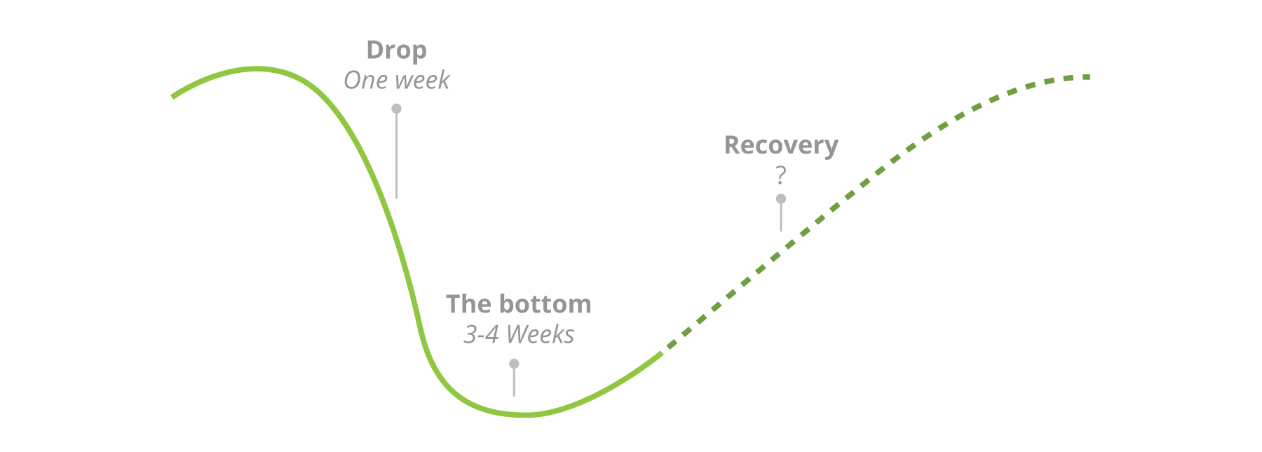
For this reason, we collaborated with Mike to create a real estate tracker to analyze the market recovery trend better. The tracker monitors the three major lead indicators for demand, supply, and inventory, which are:
- New listings: a lead indicator of the market's supply by providing the total number of homes listed for sale during a given time period.
- Pending sales: a lead indicator of the market’s demand by providing the total number of offers being made and accepted on a home, still awaiting settlement.
- Active listings: a lead indicator of the market’s inventory by providing the total number of homes currently available for sale.
Market supply (New listings)
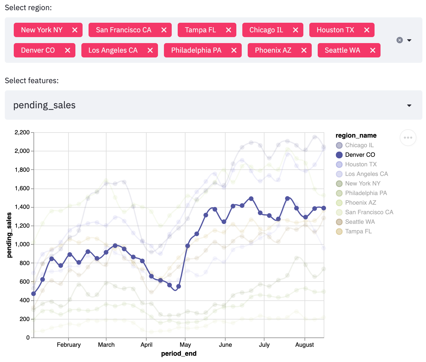
The first analysis results demonstrated a significant decline in new listing volumes across all major U.S. markets. Given the seasonal nature of real estate, an important dimension to consider is year-over-year performance, by comparing 2020 with 2019 over the same time period. From a more in-depth analysis of the data, it could be observed that the year-over-year decline rates and timing vastly differed among the cities. As Mike explains: “Metro areas like Los Angeles, New York City, and Chicago were affected the earliest, while Denver and Phoenix didn't experience a significant decline until 15 to 20 days later.” To better explain this phenomenon, we analyzed and compared the number of days since new listings declined 5% compared to the previous year for each major city.
Market demand (Pending sales)
Applying the same year-over-year comparison, but for the pending sales, we analyzed the buyer’s demand trend. The pending sales annual comparison showed that many markets were down between 20 to 80% compared to the last year's period. As Mike stated back in May: “Volumes are down over 35 percent nationally, with some markets down as much as 60 to 80 percent compared to last year. Buyer demand is beginning to recover in some markets, but not all.”
The recovery challenges of the U.S. real estate
As lockdowns and restrictions ease, U.S. markets begin to recover on their transactional volumes, although not all markets are recovering at the same speed. Moreover, the continuous decline in new listings has led to reduced inventories, causing a supply vs. demand imbalance. As Mike explains: “The significance is that when new listings stop coming to the market, overall supply -- inventory -- drops.” To support this claim, we analyzed the inventory by studying the trends of active listings throughout 2020 and found that most markets were down 20 to 40% compared to last year.
This is a significant disruption to the market dynamics of supply and demand. Mike concludes that even though this isn’t necessarily a problem: “if the amount of active buyers remains constant, and the available inventory drops, house prices will rise.” For a detailed discussion on how AI can help optimize the pricing strategy according to demand forecasting, check our blog post on price optimization for the retail industry.
For a further review of the international recovery trend, Mike makes an additional comparison of different markets (U.S., Sweden, and New Zealand) according to the strictness of their lockdown restrictions.
Overall, the tracker can give us a better evidence-based understanding of the real estate market's dynamics throughout this pandemic. We will now discuss the challenges of curating the data and building this tool to support Mike’s narratives and storytelling!
You have the data, we have the tools, let's tell a story!
Enhancing business narratives
Regarding the technical approach, several frameworks exist for organizing a data science project, like Microsoft TDSP, SAS SEMMA, or IBM FMDS. Most of these frameworks relate to the well-known CRISP-DM. Although CRISP-DM originated in the second half of the 90s, specifically for data mining projects, it is still widely used by the industry.
All these frameworks provide lifecycle recommendations that we can adapt to structure our data-science projects. For our case, we will use the proposed From Data Mining Processes to Data Science Trajectories, as an extension for CRISP-DM, that better suits our narrative-based project. The project trajectory is not linear, but loops and iterates from the feedback and knowledge gained throughout all major activities.

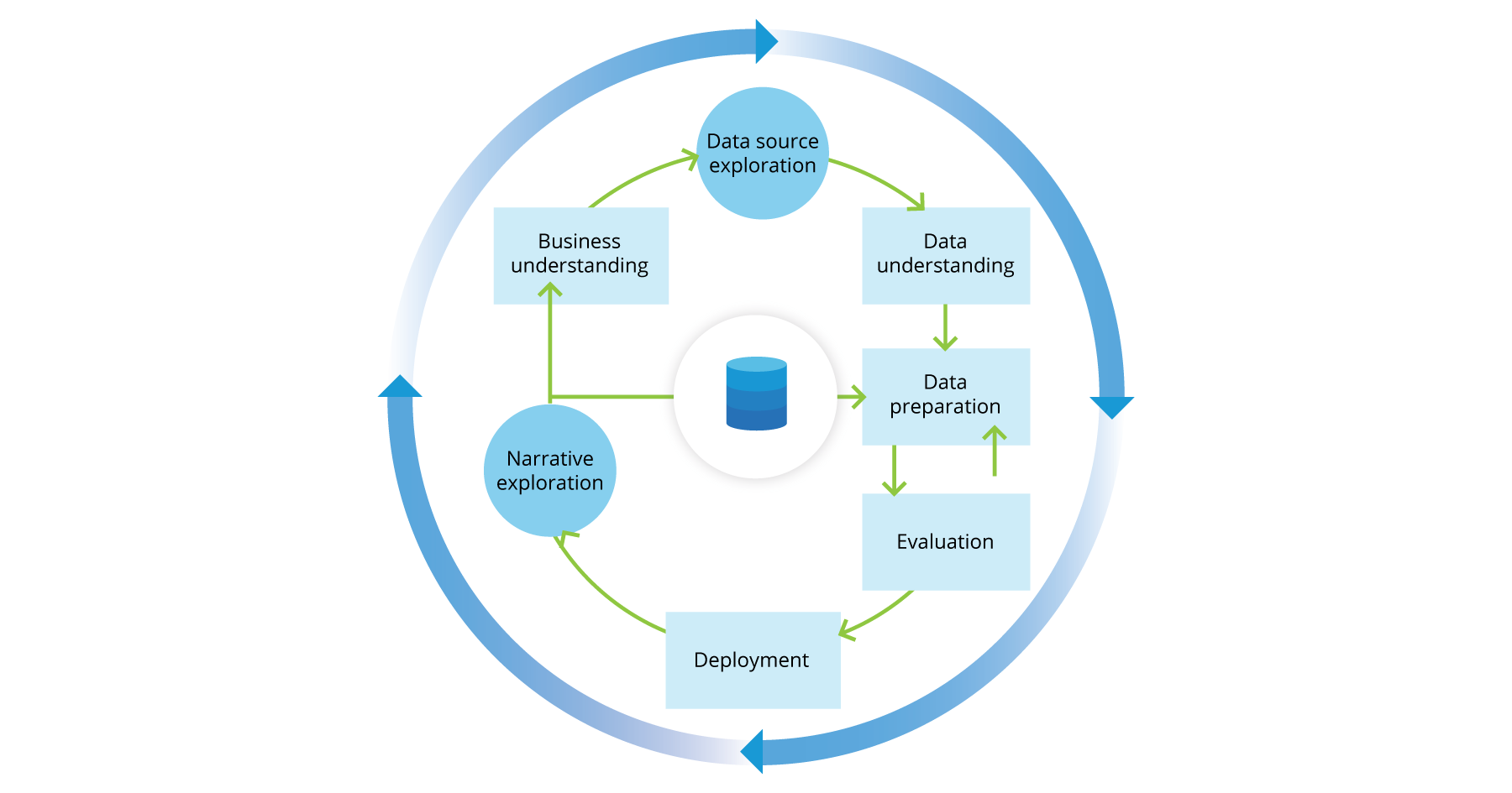
- Business understanding: Find and understand the hypotheses and questions which can support real estate storytelling through data analysis.
- Data source exploration: Discover all valuable real estate data sources with housing information.
- Data understanding: Become familiar with the housing data, identify data quality problems, and discover first insights into the data.
- Data preparation: Construct the real estate dataset by cleaning, filtering, and transforming the initial raw data sources.
- Evaluation: Assess the quality of the results for generating insights and validating/refuting our initial hypothesis.
- Deployment: Organize, deploy, and present final results for audience consumption.
- Narrative exploration: Extract valuable stories from the results and insights. The audience's feedback loops back to the preparation of new data to continue the exploration of future storylines.
Business understanding
Our first objective is to thoroughly understand, from a business perspective, what the domain expert or client really wants to accomplish through their storytelling. A possible consequence of neglecting this step is to invest a great deal of effort into producing the right answers to the wrong questions.
This is where we need to closely collaborate with our domain expert to align on the possible lines of research and exploration. Similar to Hypothesis Driven Development, we use an experimental approach based on the best available evidence. We start with a set of hypotheses or questions centered around the Covid-19 impact that we want to explore and validate/refute through data analysis. During this iterative process, questions may be refined or changed according to the discovery and insights of each storyline.
These are some major hypotheses/questions that drive our analysis:
- What are the impacts and effects of Covid-19 social distancing on the U.S. real estate markets?
- How long will it take for real estate markets to recover after the pandemic unfolds?
- Is supply increasing faster than demand while markets are recovering? Will this affect house pricing?
Data source exploration
In the initial data collection stage, we identify and gather the available data resources relevant to the problem domain. Finding publicly available datasets with high-quality data is usually a challenging endeavor. The U.S. real estate industry shares Multiple Listing Services (MLS) as a way for real estate brokers to exchange property information. However, an MLS can only be accessed by licensed agents and brokers. On the other hand, there is no single authoritative MLS and no universal data format, albeit efforts from the Real Estate Standards Organization (RESO) to propose a Web API and data dictionary standard. This implies that each real estate broker and agent decides how to structure, format, and publish their data.
Several companies aggregate multiple MLS to unify and expose the data such as Attomdata, BlackNight, and Trestle; however, they charge additional fees. Additionally, there are big online marketplaces for buying and selling properties such as Zillow and Redfin. These marketplaces provide listing aggregation from multiple local MLS partners and are willing to share some of their information publicly.
- Redfin data center: Redfin is a real estate brokerage with direct access to data from local MLS. Their dataset is computed daily as either a rolling 1-week, 4-week, or 12-week window. The local MLS data is grouped by metropolitan area and by county.
- Zillow group data: Zillow provides inventory and sales information available in monthly and weekly views, as well as home valuation through their Zillow Home Value Index (ZHVI) and Zillow Home Value Forecast (ZHVF).
We choose to work mainly with Redfin's dataset for the following reasons:
- The Zillow - Free API access is limited to 1,000 calls per day. This number can be increased, but to gain the additional calls, we must pass a Zillow audit and review.
- The terms of use state that we may not use the Zillow Data to provide a service for other businesses, and we are not allowed to store their data. This is a major drawback combined with the API call limitation.
- Redfin provides free weekly updates for our use with reasonably good data quality. The only requirement is to cite them correctly.
Data understanding
After the original data collection, we can use descriptive and visualization techniques to understand the data content, assess data quality, and discover initial insights.
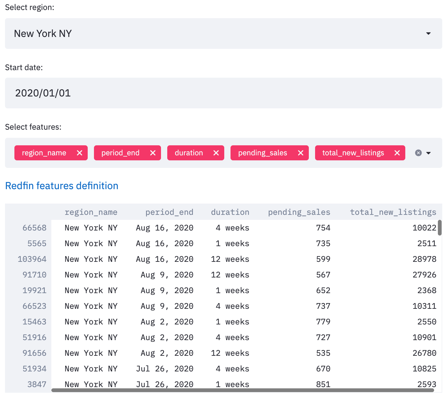
Redfin's dataset contains U.S. market data for more than 600 metropolitan areas and 1,600 counties with historical data starting in 2017. A selection of 76 different features can be grouped around the following main categories:
- Prices: Several features related to house pricing are given, such as median sale price, median price per square foot, percentage of homes sold above list price, and percentage of homes that had a price drop. These are all important features to better understand the market's pricing strategy over time.
- Sales: The sales trend can give us a better understanding of the demand for the consumer market. Some available features are pending sales and the number of homes sold.
- Listings: The listings are home sellers that make their houses available for sale, representing the available supply for the market. The main feature is new listings.
- Inventory: The inventory explains the relationship between supply and demand or listings and sales, respectively. Some available features are active listings and age of inventory.
For a more detailed explanation of each available feature, please refer to Redfin's metric definition.
We can build simple visualization charts and descriptive statistics to explore the feature space in the available regions, as shown below.


As Redfin is updating their data according to their local MLS integrations weekly, we can apply the following quality gates to assess the new data and compare the changes between updates.
- Missing transactions: As Redfin depends on its local MLS providers, they may have some missing transactions for the selected time period. This can be validated according to the numbers of data points expected during the period duration.
- Regions/Features changes: Redfin is constantly adding and discontinuing data according to their local MLS integrations. We can automate regions and feature comparisons between two consecutive datasets to understand their differences better. This can give us a better understanding of missing features or newly available data to explore.
Data preparation
Data preparation activities include data cleaning (dealing with missing or invalid values, eliminating duplicates, formatting properly), combining/filtering data, and transforming data into more useful variables. Data preparation is usually the most time-consuming step in a data science project. However, by executing an effective data understanding phase, we can better grasp the quality of the data and the needed transformation for preparing it.
In our case, we want to construct a tracker for monitoring the pandemic trend effect over the U.S. real estate supply, demand, and inventory. To make the tracker compare the performance of the markets over time, we will use the year-over-year performance by comparing 2020 with 2019 over the same time period. Year-over-year (YoY) is a method of evaluating two or more measured events with those of a comparable period on an annualized basis, as described by the following formula:
Some additional caution should be taken when calculating the corresponding period to avoid seasonalities that may affect the comparison, such as comparing different weekdays. In this case, we are dealing with rolling averages for 1-week, 4-week, or 12 week-windows, so using the same week-window between years should be sufficient.
Evaluation
Before deploying and publishing the results, we want to evaluate the dataset to understand its quality and ensure that it properly and comprehensively addresses the business problem.
On aggregating multiple third-party MLS data sources, there is always a risk of producing data drifts over consecutive updates. Therefore, this is something important to monitor and review with our domain expert for validating the data quality. We can assess and monitor changes by comparing the historical against the new dataset and alert within some drift threshold.
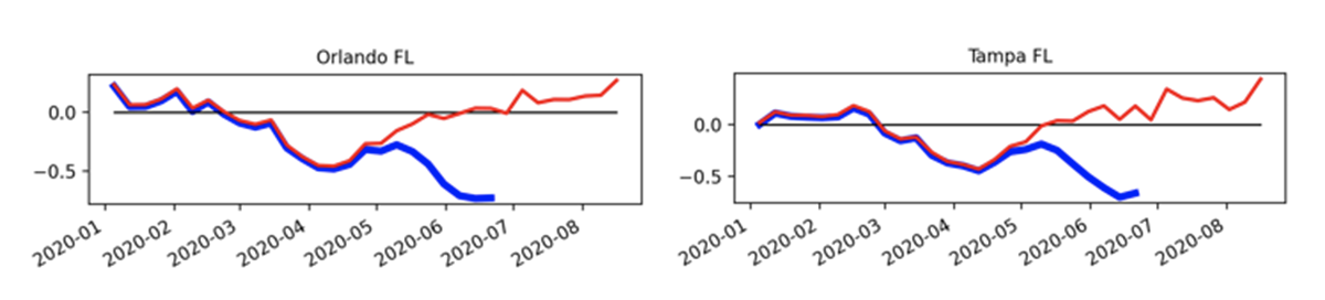
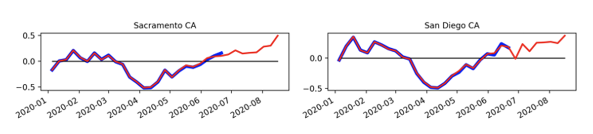
For example, on the following charts, we compare YoY pending sales on all major cities and detect that Tampa, Florida, and Orlando, Florida, have major percentage (more than 50%) trend changes within two consecutive updates. We decided to hold on to this data until Redfin data drift stabilizes.

This is also a good time to review our data pipeline process and the findings and insights with our domain expert and decide if we want to automate any additional monitoring or data pipeline process for future iterations.
Deployment
Once a satisfactory dataset and visualizations have been constructed and are approved by our domain expert, it is time to deploy and publish them on the tracker tool web page. We used several open source technologies and a simple architecture for automating the data processing pipeline with a Streamlit application.
The major modules within the application are:
- Data collection: This module will monitor new file updates on Redfin's data center, download the data from their S3 public bucket, and optimize the file by filtering out unnecessary data for the application.
- Data understanding & preparation: The new dataset can be compared with historical datasets to interactively explore their differences and find new features available for visualization.
- Data evaluation: To assess the quality of the data, some verifications are automated through alerts on missing data and possible data drifts present on the new update.
- Data deployment: We are using flourish to publish our visualizations online. The application can generate the necessary data to be imported and published on the real estate tracker charts. Finally, the published charts can be embedded on any web page or blog.
The Streamlit application is dockerized so it can be easily deployed in the cloud. A good alternative is using ContainDS that builds on top of Docker to deploy dashboards locally and free of charge.
Narrative exploration
Once the visualizations are available online, it is time for storytelling with data! Take a look at one of Mike’s recent Inman webinars, telling stories enriched by the real estate tracker insights.
Final thoughts and concluding remarks
We have shown how an evidence-based analysis can enhance business storytelling through data visualizations—even more so on uncertain scenarios. In this particular case, we collaborate with an industry expert to quantify the impact of COVID-19 on U.S. real estate markets.
The global pandemic has suddenly accelerated the need for industries to transform and respond to an unprecedented change in customer behavior and market risks. In the case of real estate, the new iBuyer business model is uniquely positioned to thrive in a world of social distancing. Mike describes the model's unintended advantages with its value proposition of no open homes, self-guided home tours, and no in-house repairs. Furthermore, the iBuyer pricing strategy strives for a fair market offer through the combination of local real estate expertise and the most current market data analytics. In these unexplored waters, where the tides continue to shift, it’s not surprising that data science and machine learning, widely recognized for its analytical and predictive abilities, has become an essential navigational tool.

If you’re interested in empowering your stories with data, just contact us

Terms and Conditions | © 2026. All rights reserved.