

Mastering pricing strategies vol 1: Intro to our market simulator


Demand forecasting and price optimization can help businesses make informed decisions regarding production quotas, inventory, and pricing. It can be a daunting task to obtain real-world data to inform those decisions. We discussed the ever-growing role of Machine Learning in solving these kinds of problems in a previous blog post. And we also provided practical examples of one of our working pipelines. Now, in this post, we will focus on a tool that can assist you in developing these strategies: our Market Simulator.
Why build a market simulator?
Let's start with a quick overview. Demand forecasting is the process of predicting the future demand for a product or service. It involves analyzing historical data, market trends, and consumer behavior to estimate the demand for a particular product or service. Price optimization, for its part, is the process of determining the optimal price for a product or service. It involves considering factors such as demand forecasts, competitors' prices, and production costs to determine the optimal price point to maximize profits. These are the issues most often encountered by our partners when they reach out to us for help.
Throughout this journey, we've dealt with many different problems. And while each case was unique, they all presented some common denominators we managed to isolate and incorporate into our own set of internal pricing tools. One of these tools - our pricing suite - takes all the lessons learned along the way into account and can be easily repurposed from project to project, allowing our teams to provide effective and tailored solutions much faster. We'll be sharing more about this tool in our upcoming blog, so keep your eyes on this space! Experience has also proven that staying competitive in competitive markets requires significant research, so we started to develop our Market Simulator.
We designed this tool to obtain accurate and risk-free scenarios to test our models and apply our solutions. We aim to loosely represent many known market situations of interest and evaluate how each model performs in the given business case. Our simulator can receive the market conditions to model along with the model we want to test. And this enables us to comprehensively analyze the given model's performance within the selected context.
Our goal when we started, was to develop a tool to help us further understand how our pricing models learn and adapt to an ever-changing reality. The tool's primary purpose is to evaluate if we were appropriately leveraging our pricing model's strengths and managing their weaknesses. It's invaluable for experimenting with new ideas to enhance our solutions further. It has proven essential in our efforts to continuously improve our strategies and provide the best pricing models available. In the next section, we'll get into the nitty-gritty of our design process, so it might get a bit more technical, but hang in there; we promise it'll be worth it!

To sum it all up, with a market simulator, we can:
- Emulate different market conditions
- Test any desired model
- Quickly evaluate and tweak all new approaches in a risk-free environment
The ins and outs of building the simulator
We built a controlled simulation of a single-item market, with unlimited supply, to accomplish the above. We specify the actual underlying demand function and configure our models to be able to find it based on their observation of market outcomes. The selected model is presented with limited historical data and must make a pricing decision based only on that data. We then set the chosen price in the market and observed the simulated customers’ response to that price (i.e., the number of units they purchased). That, in turn, becomes a new data point that can help us further understand demand, so we repeat the cycle, training our model repeatedly over time.

Our market simulation is built from a single random variable (RV): the customer’s demand . This RV takes positive integer values, so we modeled it following a Poisson distribution (we’ll provide more details about this later). What characterizes this distribution is its expected value, which depends on the features that conform to the market state. These features always include price, and can include any other feature that may be of interest like seasonal effects, seller ratings, shipping times, etc. For simplicity of this exposition, we’re going to model the expected number of units sold in the market () depending on the price (), using the following equation:
Where:
- , also known as the market size parameter, controls the overall height of the curve,
- controls the slope of the elastic region,
- controls the location of the inflection point.
 Figure 2: a) Here we can see how α affects the overall height of the curve.
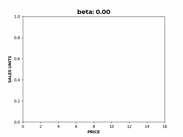 b) Here we can see how β affects the slope of the elastic region.
 c) Here we can see how γ affects the location of the inflection point.
If we wanted to model factors other than price affecting sales, instead of just a constant, becomes , any function of the covariates .
In particular, we can effectively model as a simple linear combination of the covariates, with the coefficients we choose representing the importance of each covariate:
Where:
- is a vector of size of additional features affecting demand
The power of simplicity:
- While simple, this formulation is rather flexible, allowing for the representation of multiple market realities as shown below.
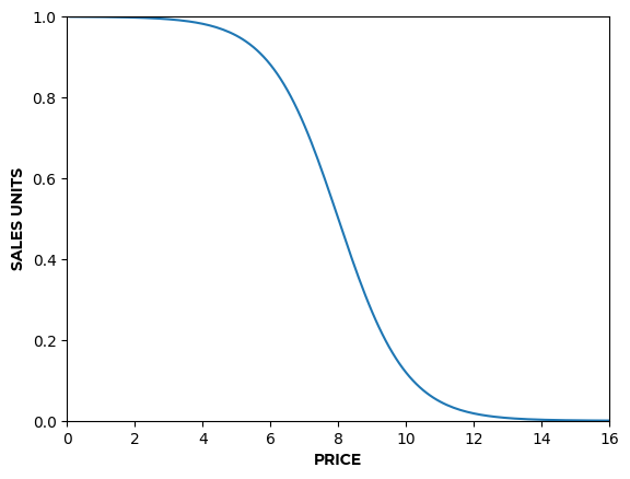
- For example, to represent perishable products, values of allow formulating a demand curve with a terminal velocity, where prices below 2 saturate demand and you don’t get any more sales even while continuing to decrease prices (Figure 3.a).
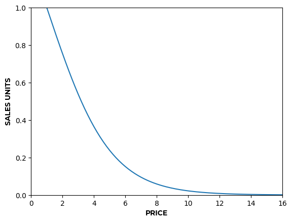
- On the contrary, values of produce a curve that keeps increasing sales units as price decreases (Figure 3.b).

Simulating demand
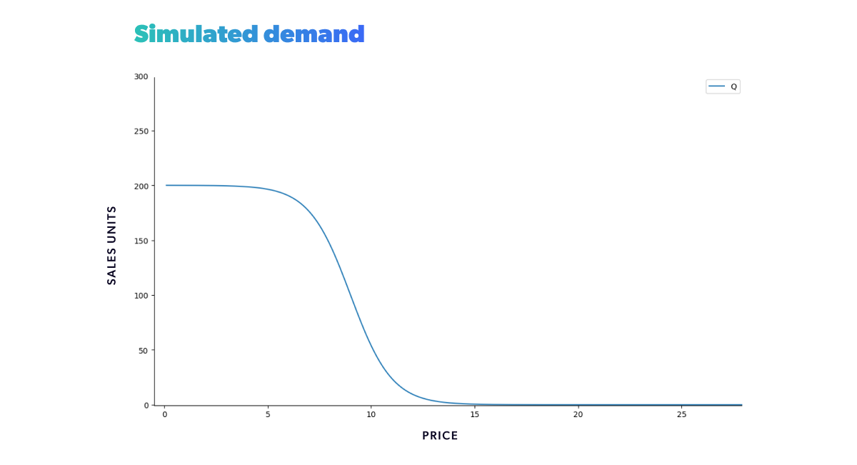
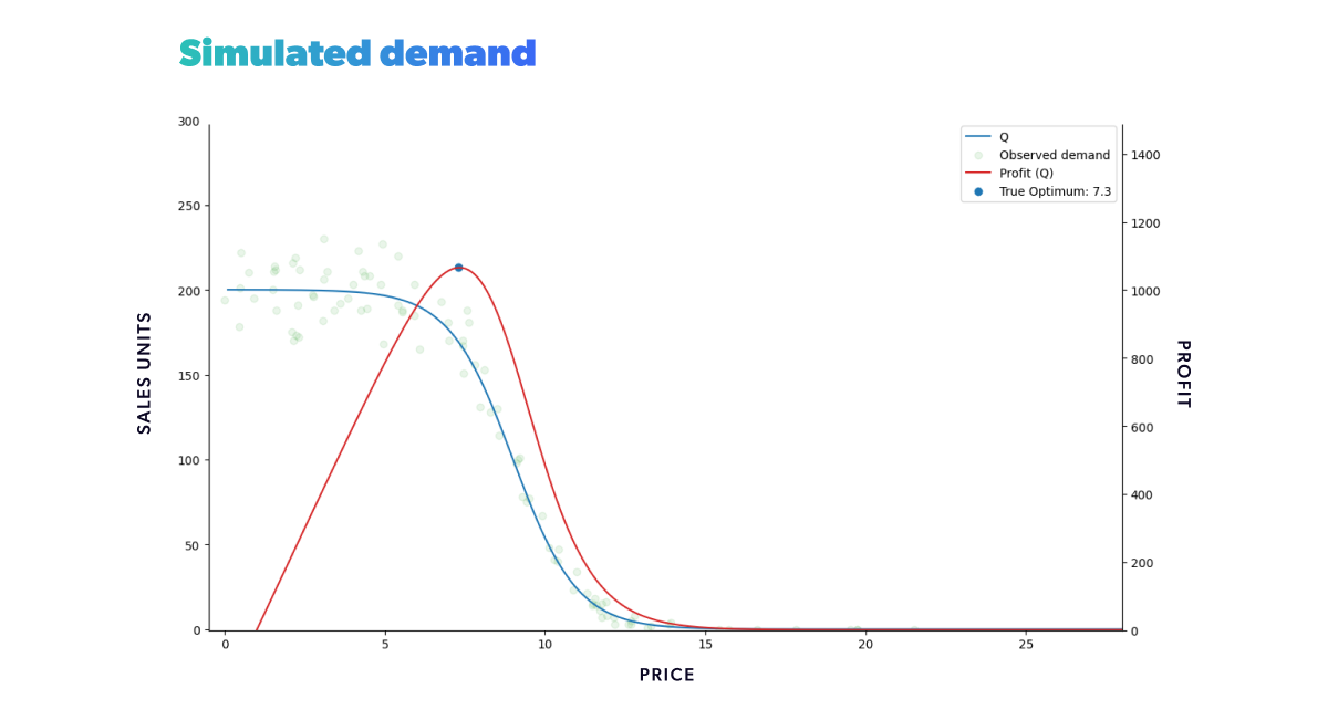
We obtain the simulated expected demand as a function of price, the blue curve shown below, by plotting the above-stated demand function. And it shows that a slight shift in price near the inflection point can cause a substantial change in demand. The further away we get from the inflection point, the less sensitive demand is to price fluctuations. This formulation corresponds then to a demand curve with terminal velocity.
Calculating the expected profit function is straightforward, as we now have an established expected demand function. Taking a specific cost of production or acquisition, c, into account, we can define our profit as a function of the expected demand as follows:
Notice that profit is also a random variable because it depends on the demand. And since profit is a linear function of demand, the linearity of expectation allows us to calculate its expected value easily.
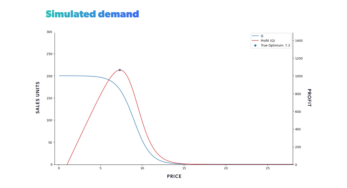
Now that we've defined the expected profit in terms of the expected demand, we can add its plot to the previous one and determine the optimal price - our (expected!) profit.
Notice that the observed profit may be higher than the expected profit for a particular realization. In the long run, the variability should be canceled out, and the expected gain should be met.
This approximates a given market situation for a particular product with an established price range and some features. In other words, we defined the expected sales rate for a given market situation , and price , (the target variable of all the demand curve regression problems). The data we have produced so far represents the ground truth we want to get as close to as possible with our chosen model’s predictions. But to generate any predictions, we are going to need data.
Every demand forecasting project is built with data. So we now need to create historical data we can work with later. We could simply randomly sample . But, in the real world, we can't observe the expected sales rate of a product directly. What we see instead is a noisy random realization of said rate. To emulate this, we should model our historical data as a sampling from a Poisson distribution using as the average rate at each price. In Figure 6, we can see the resulting historical data points in green. In this case, we sampled prices to cover the whole price range, but in practice, this likely isn’t going to be the case.
Understanding demand curves
Let's quickly recap: We now have a known ground truth expected demand function, a known expected profit function with its corresponding optimal value, and some noisy observational data to work with. What's next?
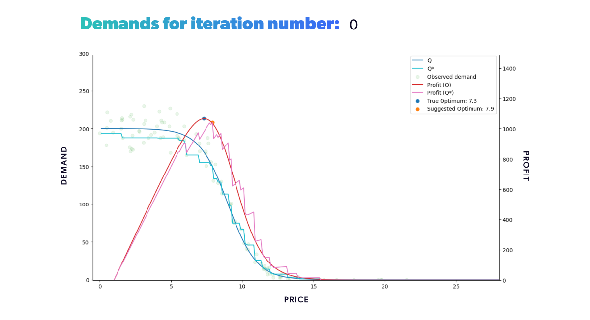
The next step is to estimate the demand curve from our noisy observations using an appropriate demand forecasting model. To try and solve this regression problem, we'll give it a go with our old friend, XGBoost. So we train our regression model of choice on the available historical data (the green dots) and use that data to predict an estimated demand curve (). The regression model will target the number of units sold, as a function of price and any other covariates of interest we have access to. An example of the resulting predicted demand is displayed in light blue below. Once we have obtained an estimated demand function, we can calculate the corresponding forecasted profit as mentioned in Eq 4.
In the following plot, we can see the aforementioned estimated profit function as a pink curve with an orange dot at its maximum value. The maximum estimated profit value observed corresponds to the predicted optimal price. With a more complex optimization problem, we could also consider things other than profit, such as how long a product took to sell and the stock available. But to keep things simple, we'll just focus on profit optimization and recommend that the price be set at the aforementioned predicted optimal price.
Notice that the suggested price given by the model is somewhat higher than the actual optimal price. That's because our information is imperfect: While close to the actual underlying expected demand, our estimate has a margin of error, as all Machine Learning models do. In this case, it's underestimating the demand near the optimal price points, making the profit smaller than expected. We can also see regions where it overestimates the demand, making the estimated profit bigger than it should be.
Tying things together
With all we've covered so far, we can create sales for any given period and in different scenarios. Our goal was to simulate market dynamics in a daily re-pricing scenario. All that's left is choosing the suggested price and observing how it fares. To that end, we created an algorithm where on , we use our historical data to predict the optimal price relative to the historical data available. Remember that the optimal price, in this case, is the price that will maximize the expected profit, which is deduced from the model's demand curve estimate. Once we obtain the optimal price, we set it as the sale price for the item and simulate the observed demand by sampling from a Poisson distribution with the known expected value given by Eq 1 at the recommended price point. By chaining all this together, we end up with the following procedure:
For every in the simulation horizon:
- Train the demand model with all the historical data up to and obtain , the demand forecast
- Simulate market features for the current time step
- Optimize forecasted expected profit using , and all possible price points to get
- Set in the market and simulate a number of sales by sampling from the realized sales units
- Add the point as a new data point
- Increase time step and repeat
If we were to repeat this process for a fixed amount of time, we would get the results shown in the animation below (Figure 8). Neat, right? With animations like this, we can easily track our model's progress through time in any scenario. We can also compare how different strategies fared in the same conditions (when fed the same data).
As we can see from our example, we start with a misguided pricing situation. In simulation step 0, all of our historical prices are way below the optimal price, and that's reflected in the resulting profit we obtained. But, if we didn't have our ground truth to compare with, we wouldn't even know this. We could only glean the market responses to the prices we set. However, as we let our model do its job, given enough time, it will suggest a new optimal price, so we end up with a good approximation of our known in the region of interest.
If you’re wondering why the suggested price doesn’t go into the price > 15 region, that’s because we bound price exploration to a region not too far away from historic prices. This is to avoid the model extrapolating too much into a region where no data is available.
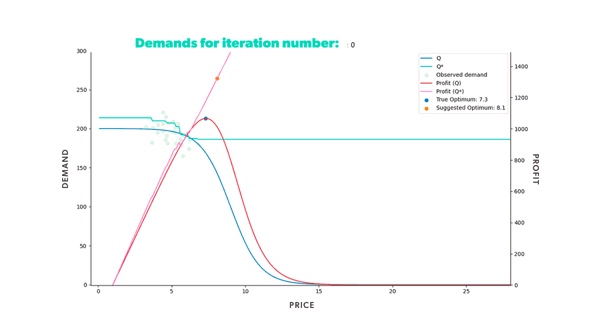 Figure 8: Re-pricing simulation. Here we show how our model learns the underlying demand through the historical data and suggests a new optimum price that we then use in the simulated market.
Looking back at the first steps of our simulation, you can see that our model suggests increasingly higher prices at the beginning of the process. As we try those prices, our model gets new input. And this new input demonstrates that our profit grows as we increase our product’s price. But only up to a certain point, after which the decrease in demand counters the price increase. Once that limit is reached, our profit starts to decrease again. It takes the model a few tries, but it quickly learns that the optimal price resides somewhere in the middle. Moreover, it does so by producing higher profits in each step than all the ones tried before.
Looking at our simulation metrics
Our 15-minute experiment enabled us to collect some interesting metrics.
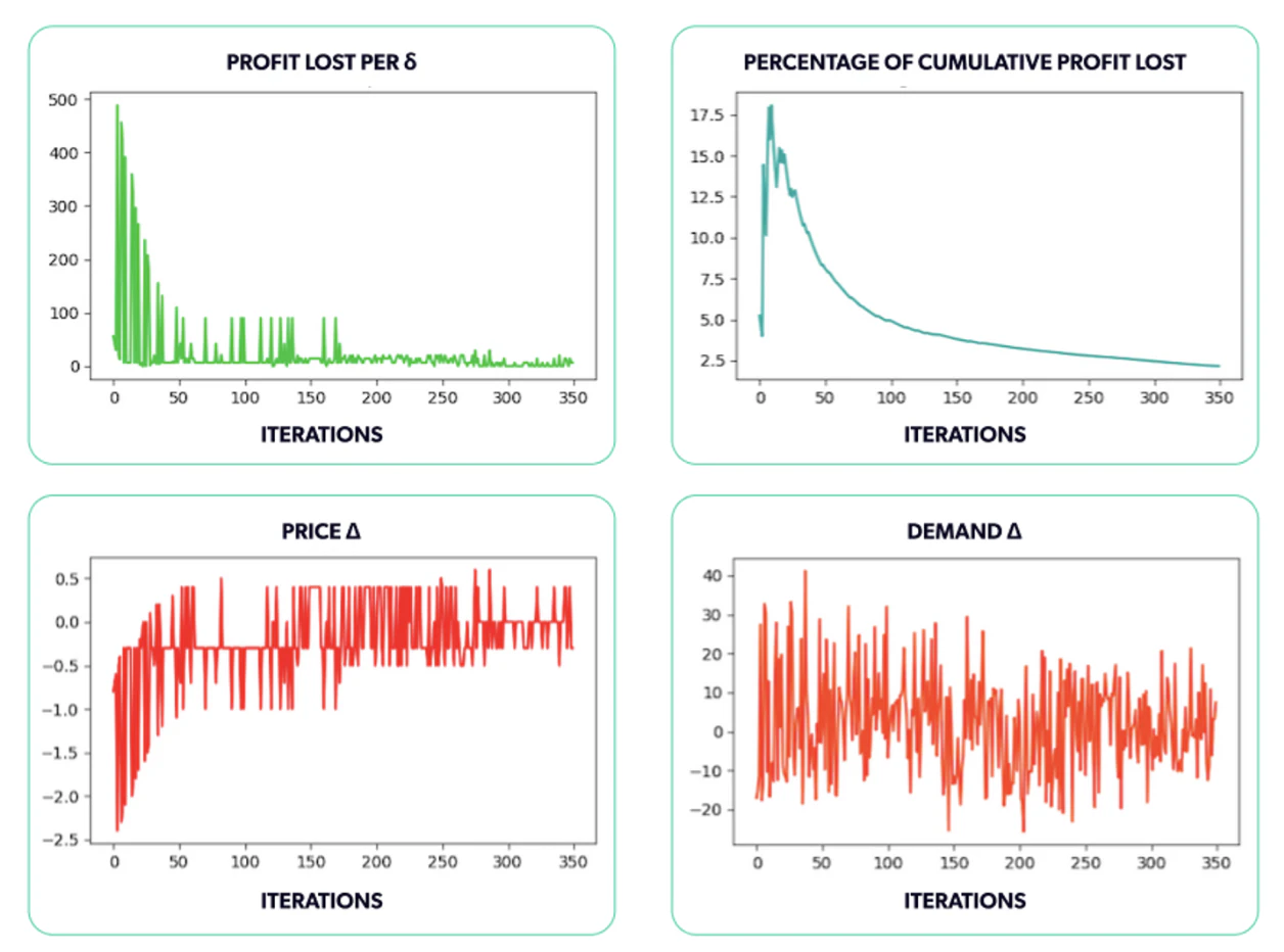
For starters, we can measure the profit lost at each step (Figure 9.a). This calculation shows how the profit we generated by choosing the predicted optimal price compares to the profit we could have made had we known the accurate optimal price every time. That value is meant to display the cost of having imperfect information. If we knew the actual underlying demand curve, we would always be able to achieve the real optimal profit. Because we simply don't have this curve, the best we can do is estimate it and use our estimate to forecast profit. This metric is also known as the model’s regret.
The difference between the true profit curve and the estimated one leads to profit losses, which we want to minimize. We start with a significant profit difference, and that's accurate because we began with prices that were way off the mark. We then see a reduction in the losses a few iterations later as our model tries out new prices, learns more, and moves closer to the optimal price. It's clear that while the model started with prices that were way off, it nonetheless managed to find the interval of the true optimal price and price consistently around it, reducing the profit losses at each step and converging to almost 0 profit lost per step.
Another plot we included is the percentage of cumulative profit losses (Figure 9.b). Here we illustrate the ratio of the total incremental profit loss up until the current simulation step. What percentage did we lose out of the total optimum profit we could have made thus far? That gives us an idea of the total profit lost throughout the simulation due to imperfect information. Even with the optimum price oscillations we end up with, we still have a very low profit loss percentage.
We were interested in tracking two additional values as the simulation progressed: the difference between the actual and predicted optimal values of both the price and the demand (Figures 9.c and 9.d). The results obtained for the run shown in the animation above are shown in the following plots. We can see that the absolute difference gets smaller in both cases as time goes by.

We also calculated the mean error (Figure 10.a) and the root mean squared error (Figure 10.b) for the predicted demand () and the expected demand using a separate set of datapoints, independent from the actually tried prices, that aims to cover the entire input space of the demand function. Ideally, we would have wanted a gridded sample across the entire demand input space, however, due to the curse of dimensionality the size of that grid grows exponentially with the dimension of the space, so we chose a random sample instead.
These values can tell us how close we are to the underlying demand, considering the entire price range shown in the animation. We're off to a good start, but there is still work to be done to determine the expected demand. In this case, incomplete observations is but one of many reasons leading to errors in the estimate. The chosen model's extrapolation outside the historically tried prices - both price extremes - is a continuation of the nearest known value. Within lower-priced regions, this is manageable, but as prices grow, the predictions become consistently poor. Hence, this region skews the demand ME and RMSE values throughout the simulation, as shown in the following plots.

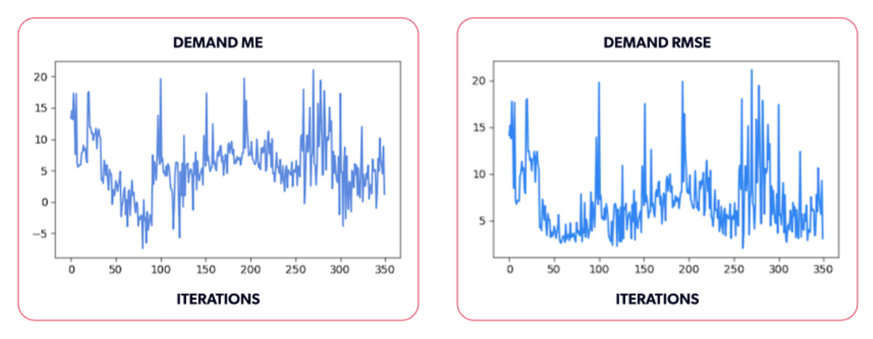
A small note. If we perform our simulation, removing randomness (the Poisson samples) and instead sampling values from the expected demand directly, we get the results shown in the following animation (Figure 11). This is a much more trivial problem, since the model can learn much faster from data without noise, but in practice, this isn’t realizable. Even then, we can still see that at very high prices, we have a constant prediction that matches the sales obtained for the highest price, since trees extrapolate with a constant value. Although the model quickly hits the optimal price in this scenario, our demand RMSE and ME would still be skewed because of the difference in the price range mentioned above (10-).
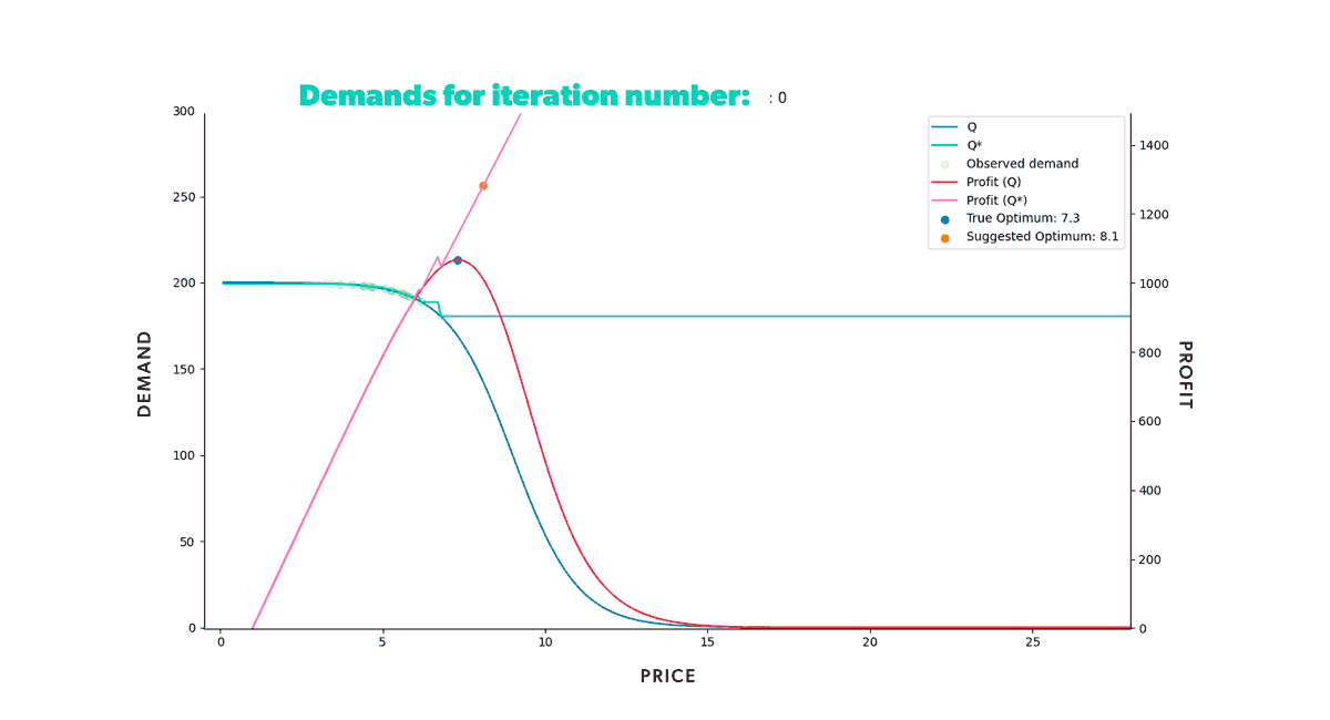 Figure 11: Simulation without randomness. If we take observations from the underlying expected demand (without randomness), estimating it is trivial.
Lessons learned, lessons shared
Glad you made it this far! We hope you come away with some valuable concepts. But just to be sure, let’s recap the key takeaways from our journey:
- We’ve built a simulator that’s capable of modeling different market realities from the ground up with a simple yet very expressive formulation.
- We’ve formalized the problem at hand, determined how to generate the synthetic information we need, and formulated the functions we need to estimate.
- We’ve implemented a Machine Learning algorithm with a data-based feedback loop to estimate both demand and profit. Said algorithm is able to converge to the desired results for the problem at hand.
- We’ve collected several performance metrics along the way, having the simulator become a “gym” for our algorithms, allowing us to compare the performance of different modeling alternatives in a controlled environment.
So we built a simulator capable of modeling different market states from the ground up. And with it, we trained several variations of XGBoost models for estimating demand, and by tracking several relevant metrics that we detailed above, we can now assess how performant each of the variants is, and which one performs the best across multiple scenarios.
This simulator has enabled faster and more effective incorporation of additional tools into our pricing strategy. We can quickly determine if a new strategy will yield better results in different simulations in a risk-free environment. Only once we are confident it performs well do we include it in an actual plan with much higher stakes.
If this post piqued your interest, stay tuned for the upcoming volume 2!
In it we’ll explore some limitations of the basic learning models and how we can leverage the simulator to overcome them, particularly striking a good balance between exploration and exploitation as well as improving the model’s behavior in the extrapolation regions.
Do you think your organization could benefit from such a simulator? Drop us a line!

Wondering how AI
can help you?

Terms and Conditions | © 2026. All rights reserved.