

Mastering pricing strategies vol 2: Exploring complex market scenarios


If you’re new to the topic of market simulations, we highly recommend reading the first blog in our series to get familiar with the basics. In that post, we briefly introduced the concepts of demand forecasting and pricing optimization. We also explained why this tool is critical to providing the best pricing solutions. Moreover, we took a deep dive into the inner workings of our simulation process and the mathematical definition of our demand function. Finally, we used the simulator to test a learning model capable of making pricing decisions and learning from them within a market scenario.
This second post will explore more complex market scenarios to test and evaluate a learning model. We’ll mainly focus on balancing exploration and exploitation while optimizing. We’ll further discuss how adding Bootstrap to the learning model’s output enables that balance.
A look back at Version 1.0
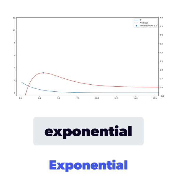
In this section, we'll quickly review our market simulator's building blocks. If you're already familiar with it, feel free to skip to the next section. As a starting point, let's revisit the mathematical definitions that determine our market. The first definition we want to review is the underlying expected demand , a function of price and, optionally, other exogenous factors. Furthermore, once we define our expected demand, we can also calculate the expected profit function as a function of the expected demand, the price, and the given cost. It's also important to remember that our historical data is modeled by sampling a Poisson distribution, using as the corresponding for each price.

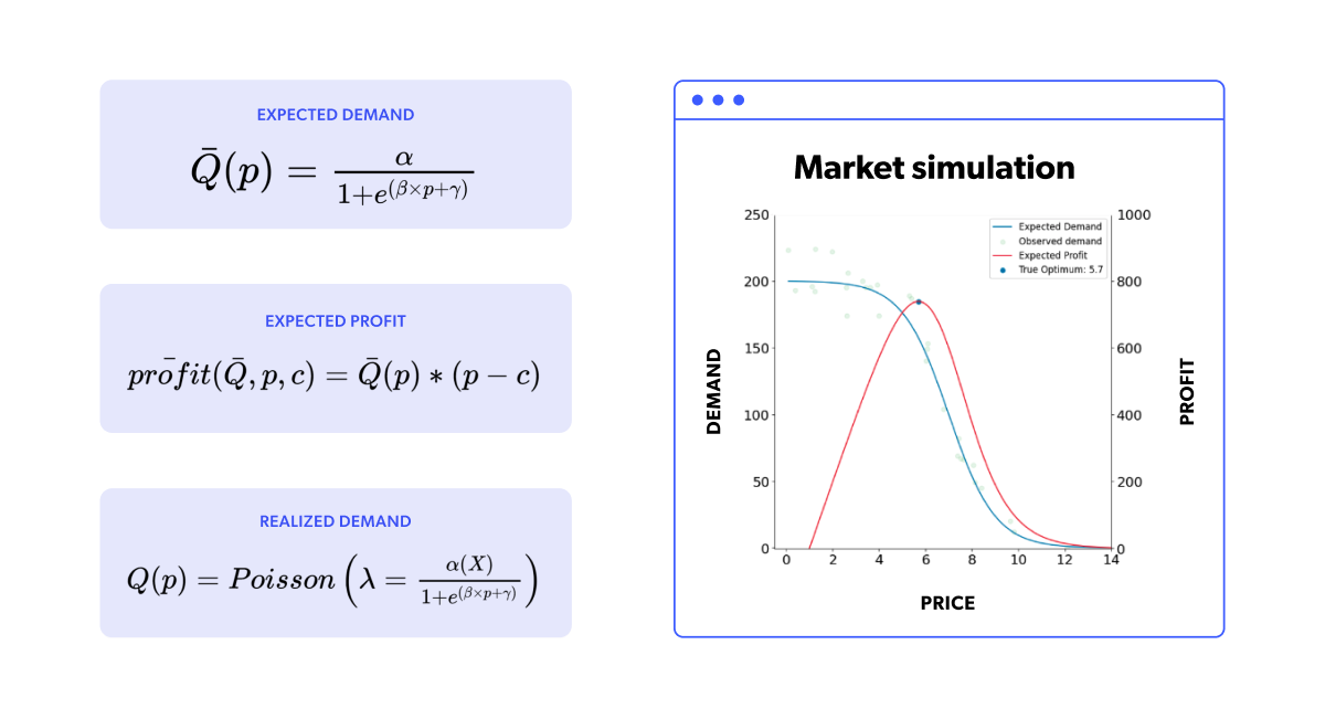
We will also briefly reiterate how the simulation works. It's a dynamic, fixed-duration timestep (think daily) market simulation where we use all the historical data available to train a specific demand forecasting model at each step. Once we obtain the values for the exogenous factors, this trained model will allow us to forecast the expected demand () for any price. These exogenous factors are a part of the market state, so the simulator actually produces their values. With the model estimating and the simulated exogenous factors , we can define a price range (the x-axis in the plot) and obtain our forecasted demand and profit. By maximizing that forecasted profit, we find our optimum price. Finally, the optimum price is set in the market, and the (simulated) market responds with its corresponding realized sales units, generating a new data point for our dataset in the process. The simulation now moves to the next time step and repeats the same process as before. In the following figure, we can see the same simulation animation as in the previous blog.
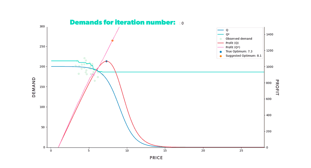 Figure 2. Animation of a market simulation loop with up to 350 iteration steps.
In our previous post, we discussed the assembly of the market simulator and modeled a single-item market scenario with a specific expected demand curve. By setting the market conditions, we were able to see how well the learning model, XGBoost, predicted the underlying expected demand. The simulator allowed us to understand the model's strengths and weaknesses since we knew precisely what the objective demand function was. Figure 2 illustrates that the model learned how to provide the optimal price in the given situation, as the suggested optimum further approached the true optimum with each iteration.
Upping the game
Our last blog post also showed how XGBoost successfully handled a pricing optimization problem given a particular scenario with fast sales in our market simulation. We now want to see how the model fares in other, more challenging scenarios.
Versatility is key
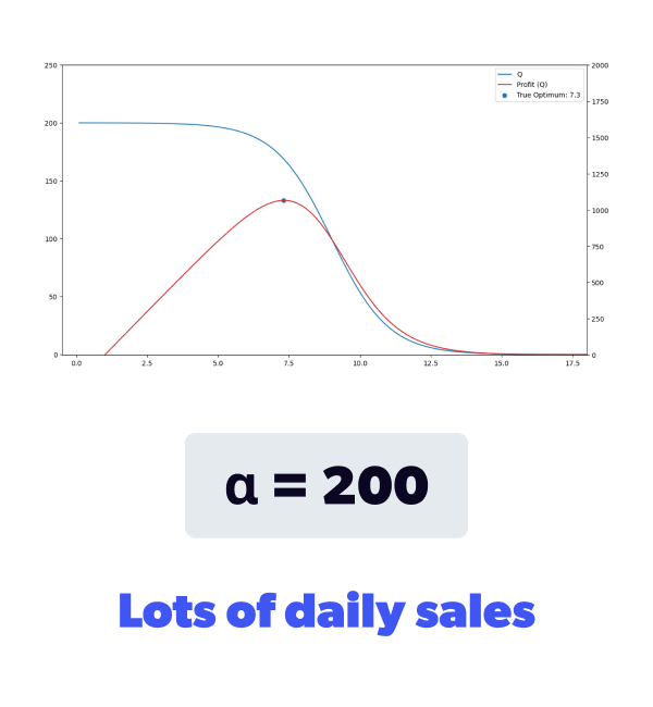
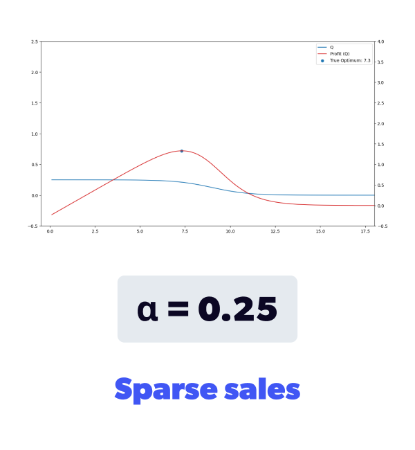
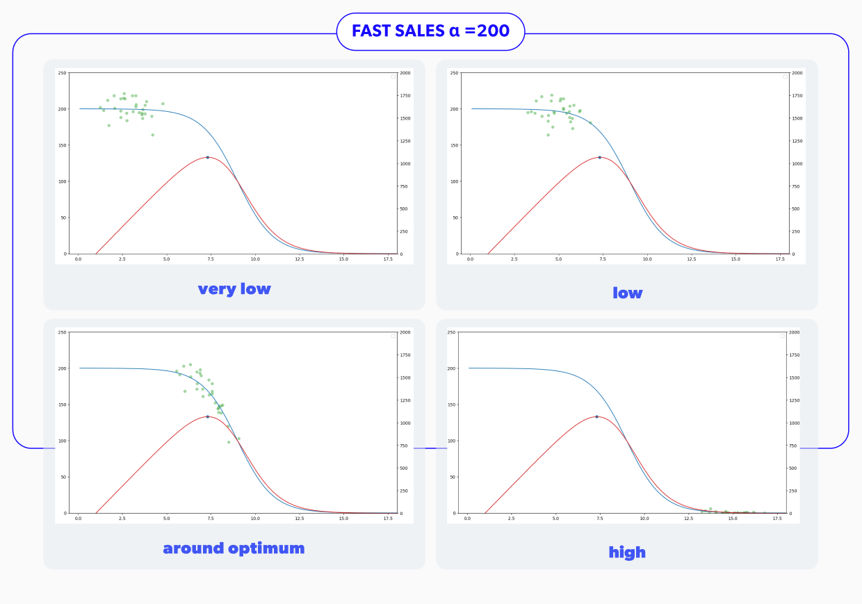
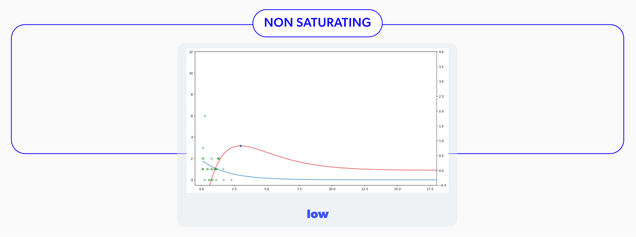
We designed the demand function’s definition with flexibility in mind. So modeling various demand curves is simply a matter of adjusting the values for , and . By doing so, we get to model different conditions of interest. We can change the speed at which our simulated item can sell, the location of the elastic region of the demand, and how steep this region is. We can also model both perishable and non-perishable products.
That means that no further price reduction will impact the number of units you sell after hitting a certain price. This demand curve is displayed on the right in Figure 3a.

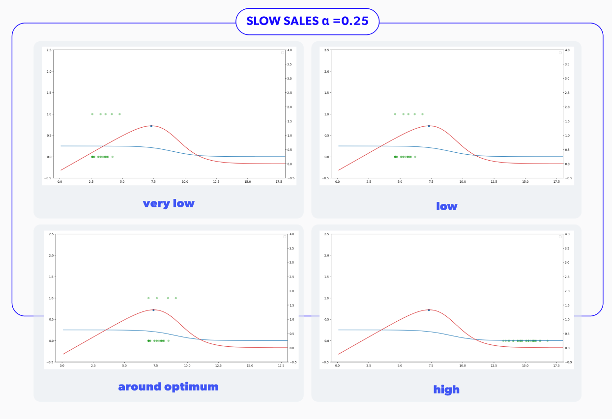
This slow demand curve is shown in Figure 3b. Notice that the y-axis is much smaller now. In particular, the expected demand, shows sales of less than 1 unit per period.
This type of demand is often referred to as 'sparse' because sales don't occur at every time step and the item's natural sales velocity is slow.
This type of demand model corresponds to a non-perishable product that the market would stockpile as the price decreases.
A bit of history
Now we have three distinct scenarios that we want to test our model on. But we also wanted to understand the impact of the historical data's price placement on our model's ability to learn. Figure 4 clearly shows what we mean by this. We have four different historical datasets that vary in where the historically tried prices are located. We've analyzed some simulations with a significant standard deviation in historical prices, but our experience has shown that this behavior is rather uncommon in real-life datasets. So we won't discuss those simulations here.
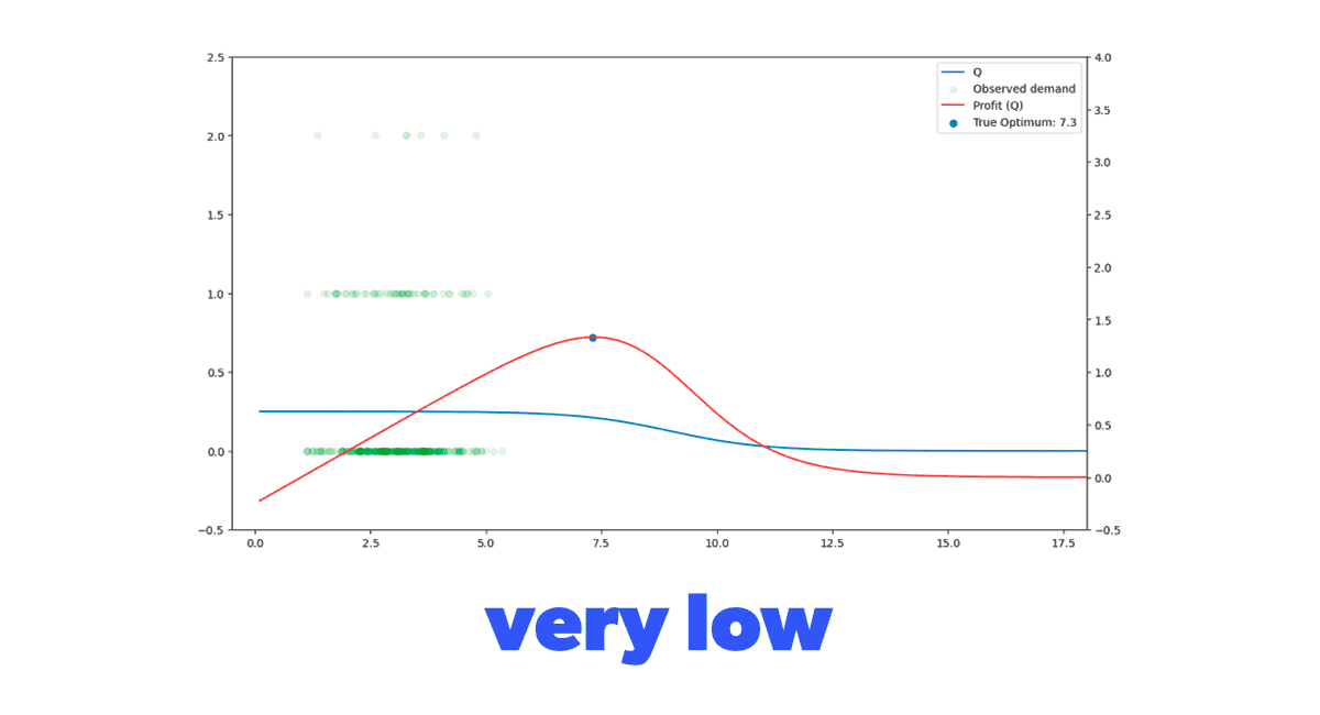 Figure 4. Different demand function and historical dataset combination scenarios to evaluate our model in.
Putting it together
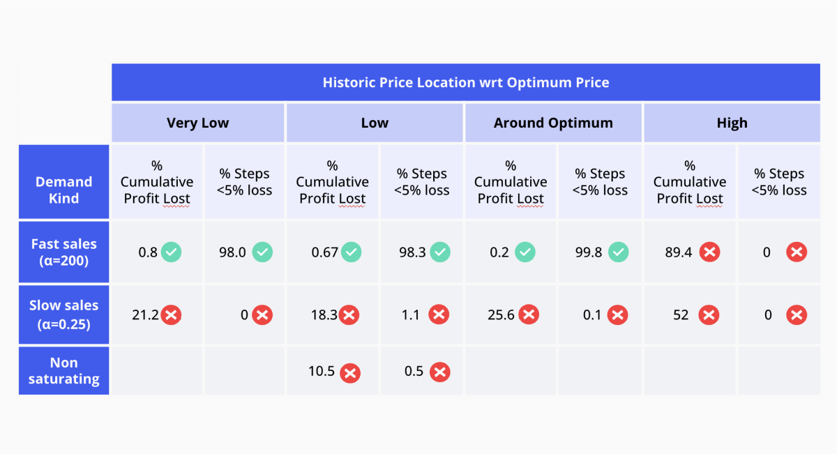
Now that we have different demand functions and historical datasets to try, we’ll combine them into the nine situations in Figure 5. Given those market realities, we’ll be testing how good our demand forecasting model is at predicting the expected demand in the daily repricing situation of our simulator. We’ll also carefully analyze if the lack of exploration becomes an insurmountable problem for our model in any scenario.


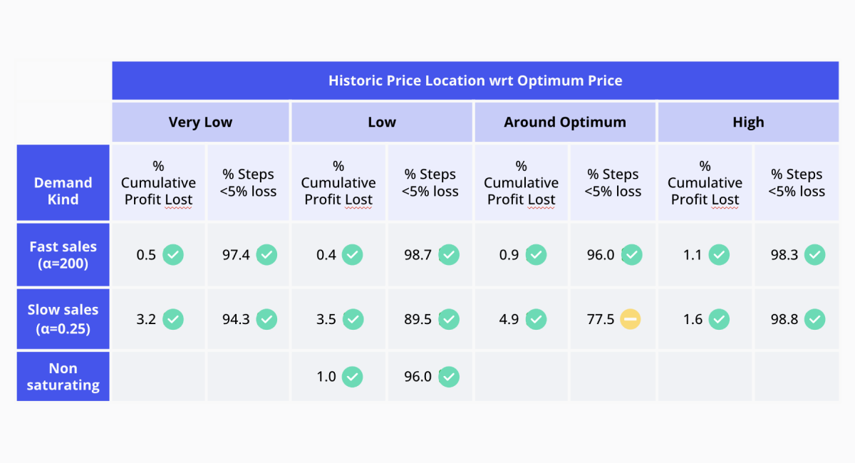
Once we run all the pertinent simulations with the configurations mentioned above, we can see that the proposed demand forecasting model had some issues. In particular, all the scenarios with sparse sales were performing poorly, as shown in the summary in Figure 6. In the displayed table, we can see two metrics to consider in determining whether or not the strategy used was successful in a given scenario. These measures correspond to the percentage of cumulative profit losses concerning the actual expected optimum incremental profit and the rate of steps with less than 5% of profit losses.
The first value was introduced in the first blog post of this series and was calculated as the percentual difference between the accumulated expected profit, had we always used the accurate optimum price, and the accumulated profit made using the predicted optimum price. A perfect score here would be 0, indicating we lost no profit even without knowing the actual demand curve.
The second measure we consider is the percentage of iteration steps in which we experienced a loss of less than 5% of the total achievable profit for that step. In this case, a perfect score would be 100% indicating all steps lost less than 5% of the attainable profit in each step.
Ideally, we want our strategy to minimize the first value mentioned and maximize the second. We use these values to evaluate our strategy's overall success in the different scenarios. As you can see, it's not performing at its best at the moment…
But one of the advantages of having the simulator is that we can now inspect model behavior in a controlled environment and, knowing what should have happened, understand where the model went astray.
We'll now zoom into one of the unsuccessful scenarios to determine what problems we can identify. The situation in Figure 7 corresponds to a market with sparse sales and historical data located just below the optimum price. Looking at the animation, we understand why this scenario is so demanding for the learning model. In Figure 7, we see that sparse sales create a 0 inflation problem. That means that we're going to have (price, sales) points with 0 sales for two very different reasons: a) because the price is too high for there to be any sales, and b) the product hasn't sold because not enough time has passed yet. That creates a challenging training set because the model can't distinguish between these two situations, and because we optimize for maximum profit, that region is of very little interest because its forecasted profit is rather low. As that price region isn't of interest, the model has very little incentive to explore those prices, failing to improve its estimates, thus missing the optimum price entirely.
We exemplified the problem with the situation shown in Figure 7, but all the failing scenarios present variations of the same problem. Fortunately, this isn't an unknown phenomenon. This is a widely known problem in Reinforcement Learning and is known as the Exploration-Exploitation dilemma.
Issues with Exploration & Exploitation
To ensure we identified the problem correctly, we designed an experiment on the other edge of the spectrum. Instead of doing pure exploitation, we’ll go down the road of pure exploration. This is not what we recommend in actual production, as price exploration has a cost, but as a theoretical experiment, it’s helpful to understand the characteristics of these approaches. So, instead of optimizing for the maximum forecasted profit, we built an agent that randomly chooses a new price from the entire price range. This strategy would undoubtedly force exploration and obtain better price space coverage. A more extensive coverage should enable the model to better grasp the expected demand curve. So we tried it, and voila! As you can see in Figure 8, exploration allows the model to improve it's estimates of the demand curve across the entire price range. The corresponding animation shows that the light blue curve is very similar to the blue curve and as time advances it becomes more and more so.
We needed to implement a sound exploration approach into our modeling strategy that would allow us to understand the demand curve in the regions where we have no data, but that's also efficient and doesn't waste time exploring prices that produce fewer gains or losses. And this exploration approach should work across all scenarios. Considering this problem and discussing potential techniques, we found many similarities with the Multi-Armed Bandit (MAB) problem.
As a brief overview, the MAB problem involves finding the best resource allocation strategy among multiple options with uncertain outcomes. To exemplify, say you have a set of slot machines, each giving a different payout. You want to determine through trial and error which slot machine to pull to maximize your gains. Typically, one would do this by pulling each slot machine's lever multiple times and building an estimate of the distribution of the expected reward of each try. After pulling each lever, you update the distribution estimates and pick the slot machine with the highest expected payout. You can quickly see that this strategy will have the same exploration problem as we do in our simulator. If we happen to receive higher samples from a slot machine that initially has a lower expected payout, we will continue to use that one and refrain from testing the others.
We can see this exemplified in Figure 9. The second slot machine had the largest expected payout when the image was taken. But if you look at the actual payouts, you can see that the first slot machine will give the largest payout. One popular way to solve this problem is the Upper Confidence Bound algorithm.
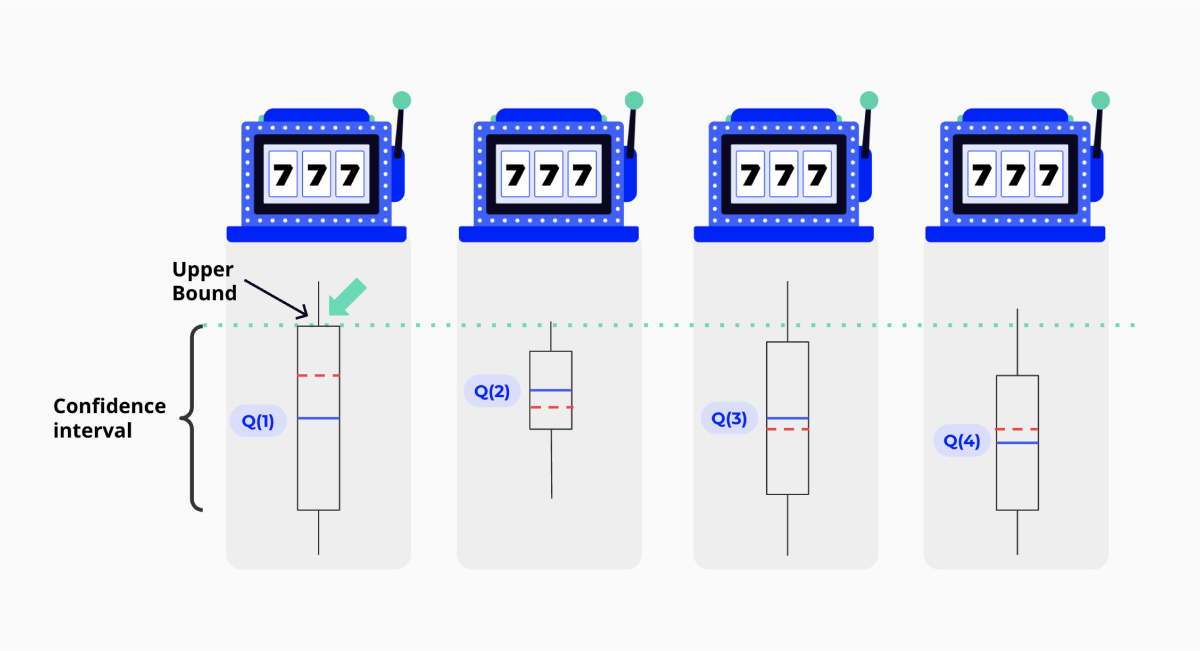
The Upper Confidence Bound algorithm is based on the principle of Optimism in the Face of Uncertainty. Before we explain that, it's important to recall that the sample mean estimator has a particular variance that depends on the sample size. The more we pull on a specific slot machine's lever, the more we can trust our sample mean estimator. In the image above, this translates to smaller confidence bands around the expected result as the confidence interval is reduced. Optimism in the Face of Uncertainty results from choosing the lever with the highest payout + uncertainty. In practical terms, this means we take the upper bound of the box we can see in Figure 9 instead of the hightop-most blue line.
If the newly chosen lever has a bigger payout, its distribution will shift upwards and gradually increase its likelihood of being picked. If it turns out we were wrong and that slot machine pays less, then the sample mean's variance will decrease, making the box smaller and the lever less likely to be picked. By rewarding pulling on levers with high variance, we encourage exploration and the discovery of new possibilities.
That sounds like a great idea, but there are a few caveats, starting with the exogenous factors. Usually, you would use the number of times a price has been tried in the past to determine sample variance, but we have multiple factors contributing to demand. It's not simply a question of having tried a particular price but also about the context in which it was tested for a specific factor. Another issue is that the price is continuous, just as the exogenous factors could be.
The question then becomes: can we build a confidence interval for our forecasted expected demand that depends on both covariates and a continuous price?
We can answer in the affirmative thanks to a widely known technique from the field of statistics: Bootstrap.
Bootstrap
Bootstrap is a method that allows you to obtain an estimate for any distribution parameter from a statistic whose values you can observe. This strategy works by resampling the original data with replacement, producing several Bootstrap samples. You then calculate the statistic of interest for the bootstrapped samples and use those to get a feel for the uncertainty of the parameter of interest. If we consider our model's forecasts as a Random Variable that depends on the samples we got in our training set, we can estimate the distribution of these targets, i.e. the forecasted expected demand, using Bootstrap. Namely, you'll obtain a high quantile of the distribution of your forecasted expected demand (can you see where this is going?).
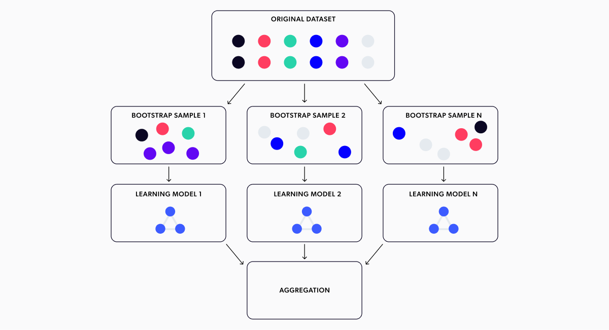
The strategy for bootstrapping the output of a machine-learning model is displayed in Figure 10. It involves training a model with each Bootstrap sample, getting the forecasted expected demands from each model, and then using all the different forecasts as their distribution estimate. We then use a high quantile to calculate the upper confidence bound. In our case, we chose the 0.8 quantile. Figure 11 shows this strategy aiding our model to explore and converge to the optimum price.
We trained 30 XGBoost models for this simulation, obtaining 30 different forecasts for each price point, following the Bootstrap technique described before. If you look at the plot above, you can see we added a few shaded areas with boundaries corresponding to several quantiles (50%, 60%, 70%, 80%, 90%, and 100% quantiles) of the Bootstrap estimated distributions. As expected, the bands are wider at the extremes where we have fewer samples. Because observations are less frequent there, we have fewer chances of one ending up in the Bootstrap samples, hence making forecasts less stable and allowing us to quantify uncertainty. This process enhances the model's ability to make predictions in areas with limited data and also enables us to measure the level of uncertainty associated with those predictions.
Let's be optimistic and optimize for the 80% quantile of the forecasted demand (and hence for profit since the profit function is a linear function), achieving the exploration effect we want. Looking at the above, it's easy to see that the price dispersion the model is trying is much higher now. The model tests out different sections of the demand curve and learns from them, eventually discovering the optimum price. Also, it's not trying prices at random. It's exploring prices that make sense. And most of the time, the prices that produce profits are very close to the optimum.

Side note:
If you paid attention to the simulation’s animations, you might have noticed that the expected demands look pretty smooth compared to the usual XGBoost output. Don’t worry; your eyes aren’t deceiving you. We just found XGBoost’s output a bit too angular for a demand curve, so we smoothed it out a little.
Choosing the number of models you’ll be bootstrapping is not trivial. If you use too few, you may not get enough exploration, but it will be less computationally expensive. On the other hand, the more models you use, the better the results, but the computational costs increase proportionally. You should keep this in mind when using Bootstrap for your projects. We recommend trying different quantities of models to determine the best trade-off between time, resources, and the results obtained for your project(s).
We used this strategy in all the market simulations we mentioned earlier, as shown in Figure 12. Pretty awesome, right? All these scenarios are played out in parallel for multiple learning agent candidates. This allows us to observe all these variant models' behavior and understand their strengths and weaknesses. With this approach, we can not only select the most effective model but also identify any issues with its performance to make necessary improvements. This leads to quicker R&D cycles and more efficient development.
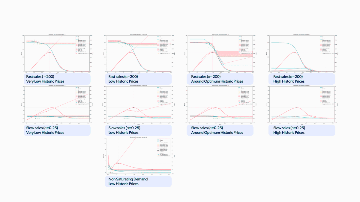 Figure 12. Gif with all the scenarios playing at once.
To emphasize the findings, we reconstructed the chart we presented earlier with the updated results, as illustrated in Figure 13. We can see that the model reaches the optimum price across all simulation scenarios now. The difference from the results shown in Figure 6 is massive. And we even managed to limit the percentage of cumulative profit losses to less than 5% in all cases!

Wrapping up
If you made it this far, thank you! It shows you're as interested in these pricing problems as we are! Let's provide a brief recap of everything we've learned so far.
- Pricing pitfalls in live production can be difficult to anticipate without evaluation. A market simulator can help by testing scenarios and bringing potential problems to the surface for better decision-making.
- Determining the optimal price point for a market will involve exploration. It's impossible to predict the outcome of a price range without testing. It's critical to try out different options to better understand potential outcomes.
- Using statistical techniques like bootstrapping maximizes data utility and quantifies uncertainty, leading to smarter explorations and informed pricing decisions.
- We were able to validate the above claims across a varied range of scenarios using the simulator, ensuring that our models are better prepared for production use and maximizing our clients' success.
Final thoughts
Although Bootstrap played a crucial role in our approach and ensured that all scenarios converged, the pace of convergence was not quite up to our standards - it was a bit slow for our tastes. To achieve the final results above, we tweaked our pricing agent even further - particularly regarding its approach to unknown regions.
If you're interested in getting more information about these developments, whether you have a specific market scenario you'd like to test out using our simulator or if you're interested in evaluating a particular model, we'd be delighted if you got in touch with us.

Wondering how AI
can help you?

Terms and Conditions | © 2026. All rights reserved.